

Traffic is coming in. Paid campaigns are running. Organic pages are getting visits. Yet the numbers that matter stay flat because people aren’t completing the action you built the site for.
That’s usually the point where teams start guessing. They change headlines, move buttons, redesign pages, or add more content. A proper conversion rate optimisation audit stops that cycle. It gives you a working diagnosis before you spend design or development time on the wrong fix.
At Ascendly Marketing, the audit starts with a simple rule. We don’t treat conversion problems as isolated page issues. We treat them as journey issues. A weak result on a pricing page, product page, lead form, or checkout flow usually comes from a broken sequence of intent, clarity, friction, and trust. The audit has to connect those pieces.
Laying the Groundwork for Your CRO Audit
Most sites don’t have a traffic problem first. They have a definition problem. If five teams answer the question “what counts as a conversion?” in five different ways, the audit will drift before it starts.
Set one primary conversion goal for the audit. Choose the action that maps directly to revenue or qualified pipeline. For a B2B site, that might be a demo request or a contact form submission. For e-commerce, it’s usually a completed purchase. For SaaS, it may be a trial signup. Matomo’s CRO audit framework recommends starting with a measurable conversion goal, then reviewing analytics, behavioral evidence, form friction, and funnel drop-off points in sequence, rather than jumping straight into design changes in its stepwise CRO audit framework.
Choose the KPI before you touch the data
A clean audit starts with a question like this:
- Primary KPI: What single action matters most right now?
- Conversion scope: Which pages and steps influence that action?
- Visitor scope: Are you auditing all traffic, or only high-intent traffic?
- Success window: What does a completed conversion look like in your analytics setup?
When teams skip this, they mix micro-actions with business outcomes. Scroll depth, time on page, and CTA clicks can help explain behavior, but they don’t replace the main KPI.
Practical rule: One audit. One main conversion goal. Everything else supports diagnosis.
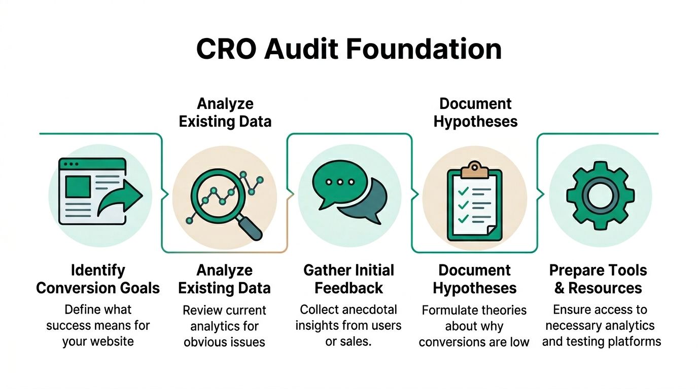
The tool stack comes next. Don’t open dashboards just to browse. Confirm access and tracking first. You need analytics for page and funnel performance, behavior tools for observation, and some form of feedback capture. In practice, that usually means a web analytics platform, heatmaps, session recordings, surveys, and direct sales or support feedback. UXCam and other modern CRO frameworks treat objective setting, behavioral data collection, funnel analysis, voice-of-customer feedback, testing, and iteration as one connected process in a repeatable CRO audit cycle.
Build the audit around evidence, not opinions
Before reviewing any page, check four things:
- Analytics integrity: Conversion events, thank-you pages, or purchase events must fire correctly.
- Channel labeling: Traffic source data needs to be clean enough for segmentation later.
- Behavior capture: Heatmaps and session replays should already be collecting data on priority pages.
- Internal context: Ask sales, support, or account teams where prospects hesitate most.
That last point gets ignored too often. If sales repeatedly hears “I couldn’t tell what happens after I book” or “the pricing page confused me,” that’s not proof. But it is a useful starting signal.
If you want a broader planning resource before the audit begins, Quikly’s guide to modern e-commerce conversion optimization is worth reading because it frames optimisation as a system, not a collection of isolated tweaks.
Uncovering Problems with Quantitative Data
Once the goal is fixed, the next step is blunt. Find where users leave.
That means funnel analysis first, not page decoration. The pages with the highest abandonment deserve attention before pages with lower stakes. Across major CRO guidance, teams are told to map the funnel, identify exit routes, and focus testing on the biggest friction points. Power Digital also cites a global average website conversion rate of 3.68%, with top-performing websites at 11% or higher, while e-commerce references often place typical conversion rates in the 1% to 4% range in its CRO audit guide and benchmark discussion.

Start with the funnel, not the homepage
In Google Analytics 4, I’d usually begin with Funnel Exploration and Path Exploration. On other analytics platforms, the labels differ, but the task is the same. You need to see the sequence from the entry page to conversion and isolate the exact step where completion breaks down.
For an e-commerce checkout flow, the core path often looks like this:
| Step | What to inspect |
|---|---|
| Product page | Add-to-cart rate, exits, device split |
| Cart | Cart exits, coupon behavior, shipping surprise signals |
| Checkout details | Form abandonment, field interaction, validation errors |
| Payment step | Drop-off after payment selection, retries, exits |
| Thank-you page | Confirm final conversion tracking |
A common mistake is treating checkout as one block. It isn’t. If the largest drop occurs between cart and checkout, that suggests a different issue than a drop between payment and confirmation.
Segmentation changes the diagnosis
Raw averages blur the problem. Segment by traffic source, device type, and key landing pages. VWO highlights traffic-source segmentation and funnel visualization because weak performance often comes from a specific mismatch between channel intent and page experience, not from the entire site.
Here’s a practical example. Paid search traffic may convert poorly on mobile while direct traffic performs fine on desktop. That doesn’t mean your whole checkout is broken. It may mean the mobile landing page sets the wrong expectation, or a page element shifts poorly on smaller screens.
Use segmentation to answer questions like these:
- Source split: Does paid social underperform because the landing page doesn’t match ad intent?
- Device split: Does mobile show a sharper drop on forms or checkout fields?
- Page split: Are exits concentrated on one pricing, product, or signup page?
- New vs returning visitors: Are first-time users hesitating while return users convert cleanly?
If bounce and exit problems appear early in the session, that’s often a separate issue from late-stage friction. For teams diagnosing that first layer, Ascendly’s guide on how to reduce bounce rate on a website is a useful companion because it helps isolate weak message match and early-page disengagement.
The strongest audit findings usually come from one narrowed statement, not a broad complaint. “Mobile paid traffic exits on the first checkout step” is actionable. “Users don’t like the site” is not.
After the funnel view, move to page-level reports. Look at landing pages, pricing pages, product pages, signup pages, and checkout steps. Compare conversion contribution against exits, bounce rate, CTR, and engagement signals. Don’t collect every metric available. Pull the ones that explain movement toward or away from the primary goal.
A short walkthrough helps here:
What hard data can and can’t tell you
Quantitative data is excellent at locating the leak. It’s weak at explaining the human reason behind it.
If a lead form loses users after the company-size field, analytics won’t tell you whether people felt the question was intrusive, confusing, or irrelevant. If a pricing page has a high exit rate, the chart won’t tell you whether the pricing is unclear or the offer doesn’t fit the audience.
That’s why the numbers should end with a shortlist, not a redesign brief. By this stage, you should have a ranked set of suspect pages and suspect steps, each tied to a measurable drop in the journey.
Understanding the Why with Qualitative Research
Numbers show the drop. Recordings show the struggle.
One of the most useful moments in a conversion rate optimisation audit is watching a real session where a visitor behaves exactly the way the funnel report suggested, then seeing the friction happen in plain view. A user lands on a product page, scrolls quickly, taps the size guide, returns, hesitates at shipping details, adds to cart, reaches checkout, then stops at a form field that asks for information they didn’t expect to provide. The session ends there.

What to watch for in recordings and heatmaps
Session recordings work best when you review them in clusters. Don’t watch random clips. Filter by users who reached a key step and then abandoned. Then look for repeated behavior.
Patterns that matter:
- Rage clicking: Repeated clicks on elements that look interactive but aren’t.
- Backtracking: Users moving back and forth between pages because they can’t decide.
- Form hesitation: Long pauses, field re-entry, validation loops, or abandoned fields.
- Dead-end scrolling: Users scanning deep into the page without finding the next action.
Heatmaps help when the issue is page structure rather than flow. If users click repeatedly on secondary elements while ignoring the main CTA, the hierarchy may be wrong. If they stop scrolling before shipping, trust, pricing, or FAQ content appears, that content is too low on the page or introduced too late.
Read behavior with context
Qualitative tools are easy to misuse. A single frustrating session doesn’t justify a site change. The point is to find repeated friction that supports the quantitative pattern already identified.
Field note: When the same hesitation appears across multiple sessions at the same step, you’re no longer looking at an isolated user preference. You’re looking at a design or information problem.
Voice-of-customer inputs matter here too. On-site surveys, post-purchase surveys, support tickets, sales-call notes, and live chat transcripts often explain friction in language your team can use directly. Users rarely say “your information architecture is poor.” They say “I couldn’t figure out what was included” or “I didn’t know if I could cancel.”
A practical example from a checkout review
Suppose the data shows a major drop on the first checkout step. Recordings then show visitors repeatedly clicking into the promo code field, leaving to search for discounts, and not returning. Heatmaps show high interaction with shipping and returns text. Survey comments mention uncertainty around delivery timing.
That cluster leads to a stronger finding than “checkout converts poorly.” The better finding is this: users are pausing at checkout because they’re still resolving value and risk questions that should have been addressed before checkout began.
That changes the recommendation. You probably don’t need a visual redesign first. You may need clearer shipping, returns, and pricing communication earlier in the journey, along with better handling of discount expectations.
Conducting a Heuristic and Technical Performance Review
Behavior data tells you what users did. A heuristic review asks whether the page itself creates confusion, friction, or anxiety before a user even interacts with it.
I run this review on the pages with the strongest commercial intent: product pages, pricing pages, lead forms, signup pages, and checkout steps. VWO identifies page-load time, bounce and exit rate, cart abandonment, session duration, engagement rate, and conversion rate as core diagnostic metrics, with a focus on those high-intent pages and on problems caused by channel-page mismatch or a single broken step in the journey in its evidence-led CRO audit guidance.
Ask hard questions page by page
Use a checklist, but don’t use it mechanically. The point is to force a direct review of clarity and friction.
Clarity of offer
- Is the main benefit obvious without scrolling?
- Does the headline describe the outcome or just the product category?
- Can a first-time visitor understand what happens next?
Decision support
- Are price, features, shipping, returns, or next-step details easy to find?
- Does the page answer the objections that sales hears most often?
- Are users forced to hunt for basic information?
Action friction
- Is the CTA visible and specific?
- Are there too many competing actions on the page?
- Does the form ask for information that isn’t necessary at this stage?
Anxiety and trust
- Do users see proof, reassurance, or process clarity near points of hesitation?
- Are policies easy to access?
- Does anything on the page create doubt because it feels incomplete or inconsistent?
If a page asks users to make a high-intent decision while hiding basic decision-making information, the page isn’t persuasive. It’s incomplete.
Review the technical layer separately
A page can have clear messaging and still lose conversions because it performs badly.
Check these items during the audit:
- Page-load behavior on mobile and desktop, especially on pricing, product, signup, and checkout pages.
- Mobile usability for tap targets, form spacing, sticky elements, and interrupted layouts.
- Cross-browser consistency so the same form or checkout behavior works across common browsers and devices.
- Accessibility barriers such as low-contrast buttons, missing labels, keyboard traps, and unclear error handling.
For accessibility checks, a quick pass with WebAbility’s free accessibility checker can surface issues that directly affect usability, especially on forms and navigation.
Technical review also needs a sanity check against the original traffic source. If an ad promises a discount, feature, or service speed that the landing page doesn’t surface clearly, the problem may not be the page alone. It may be the handoff between acquisition and destination. That same principle applies when reviewing redesign needs. Ascendly’s practical guide on how to design a business website that converts is useful when the audit shows structural page issues instead of isolated copy problems.
What usually fails in audits like this
Three patterns come up repeatedly:
- Goal drift: Teams evaluate pages against vague ideas instead of the primary conversion action.
- Over-redesigning: They jump to a broad visual rebuild before locating the exact leak.
- Ignoring qualitative evidence: They trust dashboards alone and miss visible user confusion.
A proper review catches the narrower issue first. Then it decides whether the fix belongs in content, layout, UX flow, or technical cleanup.
Prioritizing Opportunities and Forming Hypotheses
Most audits uncover more issues than a team can act on at once. That’s normal. A useful audit doesn’t hand over a long list and call it a roadmap. It filters.
The simplest approach is an ICE model. Score each opportunity by Impact, Confidence, and Ease. You’re not trying to create mathematical certainty. You’re forcing disciplined trade-offs. A checkout field simplification might score high because the friction is visible, the page is high intent, and implementation is relatively light. A full navigation redesign may score lower because the impact is less direct and the effort is much heavier.
Example ICE scoring framework
| Hypothesis | Impact (1-10) | Confidence (1-10) | Ease (1-10) | Total Score |
|---|---|---|---|---|
| Simplify checkout form by removing non-essential fields | 9 | 8 | 7 | 24 |
| Move shipping and returns details higher on product pages | 8 | 7 | 8 | 23 |
| Rewrite pricing page headline to clarify offer | 7 | 6 | 9 | 22 |
| Redesign full site navigation | 5 | 4 | 3 | 12 |
Turn observations into testable statements
A weak recommendation sounds like this: “Improve the checkout page.”
A strong hypothesis sounds like this: if we remove or defer non-essential fields on the first checkout step, more users will continue to payment because recordings and form reviews show hesitation and abandonment at those fields.
That format matters because it ties together three things:
- The proposed change
- The expected behavior shift
- The evidence behind it
Here’s another example. If paid social traffic lands on a product page and exits quickly, your hypothesis might focus on message match rather than page layout. The fix may be clearer value communication above the fold, not a new template.
Working standard: Every recommendation should be testable. If you can’t describe the expected effect and the reason for it, the idea isn’t ready.
Don’t confuse volume with leverage
Teams often choose tasks that are easy to ship instead of fixes that matter. That’s how audits turn into low-value housekeeping.
Prioritize changes that affect high-intent pages, repeated friction points, and moments closest to conversion. A smaller list of focused experiments beats a long queue of cosmetic updates. If you want more examples of how teams structure these decisions, Cart Whisper’s overview of conversion rate optimization strategies is a useful reference because it shows how strategy and prioritization need to stay tied together.
One practical note. This is the point in the process where some teams bring in outside execution support, whether that’s internal dev resources, a product team, or a specialist partner such as Ascendly Marketing for CRO implementation and testing support.
Structuring Experiments and Reporting on Findings
An audit that ends with recommendations but no experiment plan usually stalls. The work only starts paying off when each priority issue becomes a controlled change with a clear success metric.
Modern CRO practice treats the audit as a repeatable process: define objectives, collect behavioral data, analyze funnels and landing pages, gather voice-of-customer feedback, run tests, and iterate. UXCam frames CRO audits this way because they’re built to reduce friction continuously across checkout, lead forms, and signup flows rather than serve as one-time reviews in its overview of the CRO audit process.
Build experiments that answer one question
For each top-priority hypothesis, define:
- The control: the current page or flow
- The variation: the single meaningful change you want to test
- Primary metric: the one conversion action that determines success
- Guardrail metrics: surrounding signals such as exits, form completion flow, or downstream step progression
- Audience and segment: who sees the test
Keep tests focused. If you change the headline, page layout, trust content, and CTA label at the same time, you may get a result, but you won’t know what caused it.
Use a report structure that teams can act on
Stakeholders don’t need a pile of screenshots. They need a document that supports decisions. A clean audit report usually includes:
- Business objective tied to the primary conversion goal
- Key findings from analytics, recordings, and page review
- Evidence showing where and why friction occurs
- Prioritized hypotheses ranked by expected impact
- Experiment plan with owner, metric, and implementation notes
That report becomes operational when each recommendation has a next action. Internal teams can then connect the audit to a broader optimisation plan, including resources like Ascendly’s guide to conversion rate optimization strategies when they need a testing framework beyond the first round of fixes.
A one-off audit can identify leaks. Ongoing testing compounds what you learn from them. That’s the difference between fixing a page and improving a system.
If your site gets traffic but the conversion path still leaks, Ascendly Marketing can help structure the audit, isolate the friction points, and turn findings into a prioritized testing plan.