

TL;DR:
- Effective website UX improves user engagement and conversion rates by making interfaces intuitive and accessible. A data-driven audit combining quantitative metrics and qualitative analyses identifies critical issues, while consistent visual design and streamlined user flows enhance trust and reduce friction. Ongoing iteration through regular audits and testing is essential for maintaining optimal user experience and maximizing business outcomes.
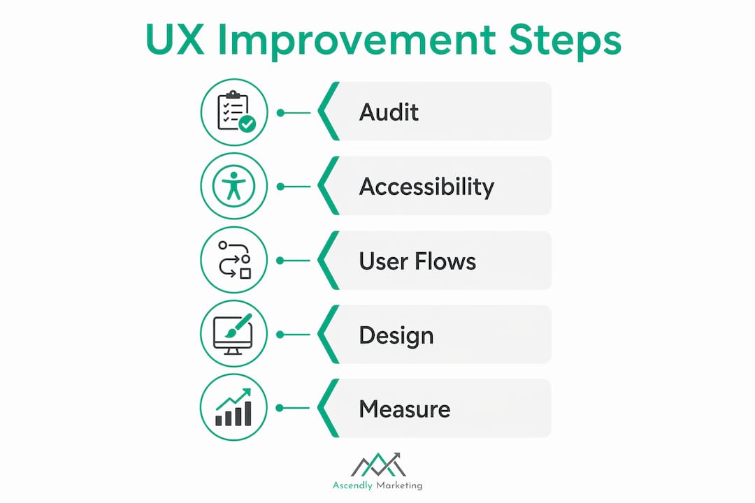
Website UX, the industry term for user experience design, is defined as the practice of making digital interfaces intuitive, accessible, and satisfying for every visitor. Knowing how to enhance website UX is the single most direct lever website owners and digital marketers have over engagement and revenue. A site that confuses users loses them. One that guides them clearly converts them. This guide covers the five core disciplines: data-driven auditing, accessibility, user flow simplification, visual design, and continuous iteration. Each step is grounded in real methodology, not guesswork.
How to enhance website UX with a data-driven audit
Every meaningful UX improvement starts with a structured audit that combines hard numbers with direct user observation. Skipping this step means fixing symptoms instead of causes.

Start with quantitative metrics. Pull your bounce rate, exit rate, task completion rate, time on task, and form error frequency from Google Analytics or a similar platform. These numbers tell you where users struggle. A data-driven UX audit pairs these analytics with qualitative methods like heatmaps, session recordings, user interviews, and moderated usability tests to explain why the struggle happens.
Layer in qualitative tools. Heatmaps from tools like Hotjar or Microsoft Clarity show where users click, scroll, and ignore. Session recordings reveal hesitation, rage clicks, and dead ends that no spreadsheet captures. Multiple data sources prevent misinterpretation. A spike in exit rate on a checkout page could mean confusing copy, a broken button, or a layout shift hiding the CTA. You need both the number and the recording to know which.
Tie findings to business KPIs. Map each UX issue to a measurable outcome: checkout abandonment, onboarding drop-off, lead form completion. This framing makes it easier to prioritize fixes and communicate value to stakeholders. A UX problem that costs you 200 leads per month gets fixed before one that costs you 10.
Prioritize with a severity framework. The PIE framework (Potential, Importance, Ease) and severity scales from 0 to 4 give teams a shared language for ranking issues. A catastrophic problem (score 4) that blocks task completion outranks a cosmetic annoyance (score 1) every time.
Pro Tip: Never rely on a single data source. Combine session recordings with funnel metrics before concluding. A recording showing users ignoring your CTA might reveal it disappears below the fold on mobile, a fact your click data alone would never surface.
What accessibility improvements do for your site’s UX
Accessibility is not a compliance checkbox. It is a UX multiplier that expands your audience and sharpens the experience for every user, including those without disabilities.
WCAG 2.2 operability principles set the standard. The four requirements that matter most for keyboard users are:
- Full keyboard operability. Every interactive element, link, button, form, and modal must be reachable and activatable without a mouse.
- No keyboard traps. Users must be able to tab into and out of any component, including custom dropdowns and modal dialogs.
- Logical focus order. The tab sequence must follow the visual and logical reading order of the page.
- Visible focus indicators. Every focused element needs a high-contrast outline so keyboard users always know where they are.
The fastest way to test this is to unplug your mouse and tab through your entire site. WCAG 2.1 AA keyboard requirements demand that modals trap focus while open and return it to the triggering element when closed. Most custom-built components fail this test on the first try.
One of the most common mistakes developers make is writing “outline: nonein CSS without providing a replacement. [Removing default focus styles](https://dev.to/toolkitonline/keyboard-navigation-testing-a-developer-complete-guide-to-wcag-operability-253) without a visible substitute makes your site unusable for keyboard-dependent visitors. The fix is straightforward: use:focus-visible` styling to provide a clear, high-contrast indicator.
Accessibility compliance improves reach, legal standing, and overall user satisfaction. Clear heading structures and proper alt text benefit screen reader users and also improve SEO crawlability. Better contrast ratios help users in bright sunlight, not just those with visual impairments. The investment pays off across your entire audience.
Pro Tip: Run Axe DevTools as a browser extension to catch automated accessibility violations in minutes. Then follow up with a manual keyboard test. Automated tools catch roughly 30 to 40 percent of issues. The rest only surfaces through hands-on testing.
Which user flow changes actually lift conversions
Friction is the enemy of conversion. Every unnecessary step, field, or decision point between a user and their goal is a place they can leave.
Cut form fields to the minimum. Ask only for what you need at that stage of the relationship. Simplifying forms and checkout flows by removing unnecessary fields can increase conversion rates by 10 to 25 percent. That range is wide because the gain depends on how bloated the original form was, but even trimming two fields from a six-field form produces measurable results.
Write clear, specific error messages. “Invalid input” tells users nothing. “Please enter a valid 10-digit phone number” tells them exactly what to fix. Validation feedback should appear inline, next to the field, not in a banner at the top of the page after submission.
Make flows linear and predictable. Checkout, onboarding, and search experiences should follow a single, obvious path. Branching logic, surprise steps, and unexpected redirects break user confidence. If a step is necessary, label it clearly in a progress indicator.
Validate every change with testing. A/B testing tools like VWO or Optimizely let you measure the actual conversion impact of a flow change before rolling it out site-wide. Pair test results with usability feedback to understand not just whether a change worked but why. For deeper strategies on reducing conversion friction, the approach extends well beyond form design into page structure and messaging.
A 1-second delay in page performance reduces conversions by roughly 7 percent. Speed is a user flow issue, not just a technical one. A fast, simple path converts. A slow, complicated one does not.
How visual design and information architecture shape the user journey
Consistent visual design and clear information architecture are what make a site feel trustworthy and easy to use. When these elements break down, users lose confidence and leave.
The core principles for visual consistency include:
- Uniform typography and color. Use a defined type scale (H1, H2, body, caption) and a limited color palette. When button styles, heading sizes, and link colors vary across pages, users spend cognitive energy decoding the interface instead of using it.
- Descriptive navigation labels. “Solutions” tells users nothing. “Website Design Services” tells them exactly where they are going. Navigation labels should match the language your users actually use, which you can confirm through card sorting exercises or search query analysis.
- Logical content grouping. Related pages should live under the same parent category. Internal linking should connect content that serves the same user goal, not just pages that share a keyword.
- Visual hierarchy for CTAs. Primary actions (buy, sign up, contact) should be visually dominant. Secondary actions (learn more, view details) should be subordinate. When everything looks equally important, nothing gets clicked.
| Design element | Common mistake | Better practice |
|---|---|---|
| Button styles | Multiple colors and shapes across pages | One primary style, one secondary style, applied consistently |
| Navigation labels | Vague category names like “Resources” | Specific labels like “Blog,” “Case Studies,” “Guides” |
| Touch targets | Buttons under 44px on mobile | Minimum 44x44px per Apple and Google guidelines |
| Content grouping | Unrelated pages under one category | Group by user goal, not internal department logic |
Responsive design is not optional. Touch targets below 44 pixels frustrate mobile users and inflate your mobile bounce rate. Google’s Core Web Vitals now factor layout stability and interactivity directly into search rankings, which means poor visual design has an SEO cost as well as a UX cost. For a deeper look at best practices in UX design, the principles of hierarchy and consistency apply across every device and screen size.
Why continuous iteration beats one-time redesigns
A single UX audit and redesign will improve your site for the moment it launches. Continuous iteration keeps it improving as user needs, content, and technology evolve.
Document every issue with a severity rating and a clear description. A shared issue log with fields for severity (0 to 4), affected page, user impact, and proposed fix gives your team a single source of truth. Undocumented issues get forgotten or duplicated.
Fix high-impact, low-effort issues first. A broken focus indicator takes an hour to fix and immediately helps every keyboard user. A full navigation redesign takes weeks and carries risk. Prioritization frameworks that blend severity, business impact, and ease of implementation keep teams focused on changes that move the needle.
Validate with A/B testing before full rollout. A/B testing and usability testing move a UX audit from diagnosis to proof. Tools like VWO Testing use Bayesian statistics to give you real-time confidence in results without waiting for a fixed sample size.
Schedule regular audit cycles. Quarterly or biannual audits catch regressions introduced by new content, third-party scripts, or platform updates. UX debt accumulates silently. Regular reviews surface it before it costs you conversions.
Report results in business terms. Stakeholders respond to revenue and leads, not usability scores. Frame every UX win as: “We simplified the checkout flow, reduced abandonment by X percent, and recovered Y leads per month.” That language secures the budget for the next iteration cycle. Pairing this with conversion rate optimization strategies gives you a repeatable system for sustained growth.
Key takeaways
Enhancing website UX requires combining data-driven audits, accessibility compliance, simplified user flows, consistent visual design, and regular iteration to produce measurable gains in engagement and conversions.
| Point | Details |
|---|---|
| Start with a structured audit | Combine bounce rate, heatmaps, and session recordings to identify the real causes of UX problems. |
| Accessibility is a UX investment | WCAG keyboard compliance and visible focus indicators improve the experience for all users, not just those with disabilities. |
| Simplify flows to lift conversions | Removing unnecessary form fields and adding inline validation can increase conversion rates by 10 to 25 percent. |
| Visual consistency builds trust | Uniform typography, color, and navigation labels reduce cognitive load and keep users moving toward their goals. |
| Iterate on a schedule | Quarterly audits and A/B testing prevent UX debt from silently eroding the gains you worked to achieve. |
What a decade of UX work actually taught us
The most persistent mistake we see from website owners and marketers is treating UX as a one-time project. They commission a redesign, launch it, and move on. Six months later, conversion rates drift back toward where they started, and nobody can explain why.
At Ascendly Marketing, we have worked with enough sites since 2013 to say this clearly: UX improvement is a discipline, not an event. The sites that sustain strong engagement and conversion rates are the ones with a documented audit process, a prioritized issue backlog, and a testing cadence. They are not necessarily the ones with the most expensive design.
The accessibility piece surprises most clients. They expect it to be a legal obligation they grudgingly fulfill. What they find instead is that fixing keyboard navigation and focus indicators often resolves UX problems that were hurting all users, not just those relying on assistive technology. A modal that traps keyboard focus also confuses mouse users who try to close it with the Escape key. Fixing one fixes both.
The data-first mindset is the other shift that changes outcomes. When a client tells us their homepage is not converting, our first question is always: what does the session recording show? Nine times out of ten, the answer is not what the client assumed. Users are not ignoring the CTA because it is the wrong color. They are not seeing it at all because a banner is pushing it below the fold on mobile. You cannot fix what you have not observed.
— Ascendly
Ready to improve your website’s user experience?
Ascendly Marketing has helped businesses across industries turn underperforming websites into conversion engines through structured UX audits, accessibility reviews, and data-backed design improvements.

Our team of designers, SEO specialists, and conversion strategists builds UX improvement plans grounded in your actual analytics, not assumptions. Whether you need a full digital marketing audit or targeted help with a specific flow, we work with your data to find the fixes that move the needle. Visit Ascendly Marketing to explore our services or book a consultation and get a clear picture of where your site is losing users and what it will take to win them back.
FAQ
What does it mean to enhance website UX?
Enhancing website UX means making your site more intuitive, accessible, and efficient for users so they can complete their goals with less friction. The result is higher engagement, lower bounce rates, and stronger conversion performance.
How do I start improving my website’s user experience?
Start with a UX audit that combines quantitative metrics like bounce rate and exit rate with qualitative tools like heatmaps and session recordings. This combination identifies both where users drop off and why they do so.
How much can simplifying forms improve conversions?
Removing unnecessary fields from forms and checkout flows can increase conversion rates by 10 to 25 percent, depending on how complex the original flow was. Even small reductions in required fields produce measurable gains.
Why does keyboard accessibility matter for UX?
Keyboard accessibility matters because it affects every user who cannot or does not use a mouse, including power users, people with motor disabilities, and anyone on a device without a pointer. WCAG 2.1 AA requires full keyboard operability, logical focus order, and visible focus indicators across all interactive elements.
How often should I audit my website’s UX?
Quarterly or biannual audits are the standard practice for sites with active content updates or ongoing marketing campaigns. Regular cycles catch regressions introduced by new features, third-party scripts, or platform changes before they erode conversion rates.