

Your dashboard says things are stable. Sales are coming in, traffic hasn’t fallen off a cliff, and overall engagement looks fine. Yet something feels off. New customers don’t seem to stick. Repeat purchases are uneven. A campaign that looked good at launch now feels expensive in hindsight.
That tension usually comes from looking at aggregate metrics. Totals blend people who arrived at different times, through different channels, with different intent. Averages smooth over the exact behavior you need to see.
What is cohort analysis? It’s the method that pulls those groups apart so you can track how each one behaves over time. Once you stop lumping everyone into one line on a dashboard, the story changes fast.
Your Business Has a Story: Aggregate Metrics Are Not Telling
A business owner reviews month-end numbers and sees total users up, conversion rate holding, and revenue flat. On the surface, nothing looks broken. Then the follow-up questions start. Why are newer customers opening more support tickets? Why did repeat purchase rate soften after a campaign that seemed to perform well? Why does paid acquisition look efficient until 60 days later?
Aggregate reporting cannot answer those questions because it mixes customers who started under very different conditions. Someone acquired in January has had time to reorder, cancel, upgrade, or disappear. Someone acquired last week has barely entered the funnel. Put both into one monthly average, and you lose the sequence that explains what changed.
Cohort analysis fixes that by separating customers into groups based on a shared starting point, then measuring how each group performs over time. The primary value is not the label. It is choosing the right cohort definition for the business question in front of you. Acquisition month helps when you need to judge channel quality. First purchase date is better when you need to understand repeat buying behavior. Subscription start date is usually the cleaner choice for retention and churn.
What aggregate reporting hides
Top-line metrics are useful for monitoring the business. They are weak diagnostic tools.
A stable conversion rate can hide falling lead quality if an older, high-intent segment is carrying the average. Flat revenue can hide a retention problem if strong upsell performance is offsetting weaker new-customer monetization. Rising customer count can still mean lower future value if recent cohorts are less likely to come back.
That trade-off matters in practice. Teams often react to the visible metric and miss the root cause. They cut spend when the issue is onboarding. They rework onboarding when the issue is channel mix. They blame seasonality when the actual break happened after a pricing or messaging change.
Practical rule: If one metric combines customers with different start dates, acquisition sources, or lifecycle stages, check cohorts before making a decision.
Your data structure matters too. Cohort work falls apart when orders, sessions, subscriptions, and customer attributes are stitched together loosely or inconsistently. If you need a cleaner reporting model, DataTeams on fact and dimension tables is a useful primer for organizing events, traits, and dates so cohort reporting holds up.
Separate the groups, and the pattern gets clearer
Once you break results into cohorts, weak spots usually stop looking random.
- Recent cohorts may perform worse because a new channel brought in cheaper clicks but lower-fit customers.
- Only one or two cohorts may underperform because onboarding, pricing, or site changes during that period hurt activation.
- Older cohorts may stay strong, which points away from product-market fit problems and toward a recent acquisition or experience issue.
- Revenue per customer may rise while retention falls, which often means discounts, bundles, or upsells are masking weaker long-term behavior.
That is the story when aggregate metrics flatten. Cohort analysis shows where growth is healthy, where it is fragile, and which change probably caused the shift.
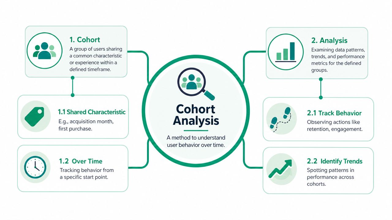
Understanding Cohort Analysis at Its Core
A business owner looks at retention and sees 28%. Useful, but incomplete. That number mixes customers who joined last week with customers who joined six months ago, people from branded search with people from a discount campaign, and buyers who signed up before a pricing change with buyers who signed up after it. Cohort analysis separates those groups so you can compare like with like.
A cohort is a set of users who share a defined trait or starting point. The analysis is the act of tracking that group over time against a metric that matters, such as retention, repeat purchase rate, trial-to-paid conversion, or revenue per user. In practice, this is a time-based segmentation method. You group people by a start event or shared characteristic, then measure what happens in later periods. HelloPM’s overview of cohort analysis explains the basic structure well.
What matters in real use is choosing the cohort definition that fits the question. If you want to know whether onboarding improved activation, group users by signup week or product start date. If you want to judge lead quality, group by acquisition channel or campaign. If you want to measure the impact of a pricing change, create cohorts around the date customers entered under each pricing model. That step gets skipped in beginner guides, and it is usually where useful analysis starts or fails.
How the standard chart works
Most cohort tables use the same layout:
- Rows are cohorts such as customers who signed up in January, February, or March
- Columns are time intervals such as day 7, day 30, week 8, or month 3
- Cells contain the metric for that cohort at that point in its lifecycle
Read across a row to see how one cohort changes over time. Read down a column to compare different cohorts at the same lifecycle stage.
That structure is what makes the chart useful. A February cohort at day 30 should be compared with a January cohort at day 30, not with January’s month 6 result. Once you line up customers by lifecycle instead of calendar date, you can see whether newer cohorts are getting stronger, weaker, or behaving differently.
This is also why cohort work becomes more valuable as reporting gets messier. In fragmented SMB data, one tool may hold acquisition source, another may hold product usage, and a third may hold revenue. Good cohort analysis forces a cleaner question and a cleaner join path. For teams trying to tighten that reporting foundation, this guide on how marketing analytics drives real SMB growth shows how better measurement supports better decisions.
Why this view is more useful than a blended average
A dashboard average shows overall performance. A cohort table shows whether the same result is being produced by different customer groups for different reasons.
For example, a stable repeat purchase rate can hide a problem if older cohorts are buying again while newer cohorts fall off early. Rising revenue can also mislead if recent cohorts spend more upfront but retain worse after month one. Those are different business situations, and they call for different responses.
A good cohort view helps answer practical questions such as:
- Did the new onboarding flow improve week-1 activation for users who signed up after launch?
- Did the pricing update change month-2 retention for customers acquired after the change?
- Did one channel bring in customers who converted quickly but churned early?
- Did a product release improve engagement for one customer segment but not another?
That is the point of cohort analysis. It does not just define a group. It gives you a way to compare the right groups against the right timeline, so you can find growth opportunities that aggregate reporting hides.
Why Cohort Analysis Is a Powerful Business Tool
Most dashboards tell you what moved. Cohort analysis gets you closer to why it moved.
That matters when you’re deciding whether to keep a campaign running, change a pricing page, or rebuild onboarding. Aggregate metrics can rise for the wrong reasons. A spike in signups can make growth look healthy even if those users leave quickly. A stable revenue line can hide the fact that newer customers are underperforming while older ones carry the business.
It separates different kinds of change
One of the strongest technical advantages of cohort analysis is that it separates cohort effects, age effects, and period effects. That distinction helps teams avoid false conclusions because a simple aggregate trend can hide whether change came from new-user quality, customer maturation, or a calendar-wide shock, according to UCLA’s cohort analysis paper.
Here’s the plain-English version:
- Cohort effect means one group was different from the start. Maybe a paid campaign attracted weaker-fit users.
- Age effect means behavior changed because customers got older in their lifecycle. That’s normal in many businesses.
- Period effect means something hit everyone at the same time, such as a site issue, a seasonal event, or a pricing change.
Without that separation, teams often credit the wrong cause.
Averages create fake confidence
Say retention improves in the dashboard right after a new feature launches. That sounds like a win. But if you separate cohorts, you might find that older users stayed flat while the newest cohort happened to come from a better acquisition source. The feature wasn’t the driver.
Or the opposite happens. Aggregate performance looks unchanged, so the team assumes the onboarding redesign had no effect. Then cohort analysis shows newer signups are retaining better, but a broad period effect dragged down everyone during the same month.
That’s why this method belongs in decision-making, not just reporting. For a broader view of using data this way, Marketing Analytics for Real SMB Growth is worth reading.
Where cohort analysis beats surface-level reporting
Cohort analysis is stronger than aggregate reporting when you need to evaluate:
- Product changes such as onboarding, feature rollouts, or checkout flow updates
- Marketing quality by comparing users from channels, campaigns, or landing pages
- Pricing decisions by checking how newer cohorts behave after a pricing update
- Lifecycle health by seeing when retention drops and where strong customers stabilize
One useful habit: Before you celebrate or panic over a trend, ask which cohort created it.
That question alone prevents a lot of bad decisions.
Defining Cohorts and Choosing Your Metrics
The idea of cohort analysis isn’t difficult. The struggle lies with setup. The method is flexible enough that you can answer the wrong question very neatly.
Cohorts are commonly defined by acquisition date, behavior, demographics, or technographic attributes, and teams should choose daily, weekly, or monthly intervals based on the business question, as explained in Optimizely’s glossary entry on cohort analysis. That flexibility is useful. It also creates room for bad choices.
Start with the question, then define the cohort
If the question is “Did our onboarding improve?” an acquisition cohort usually fits. If the question is “What do our strongest users do early?” a behavioral cohort is usually better.
Here’s a simple comparison:
| Cohort Type | Definition | Business Question It Answers |
|---|---|---|
| Acquisition cohort | Users grouped by a shared start date such as signup month or first purchase week | Are newer groups retaining, converting, or spending differently over time? |
| Behavioral cohort | Users grouped by an action they took or did not take | Which early behaviors are linked to stronger retention or revenue? |
| Demographic cohort | Users grouped by a trait such as company size, region, or customer profile | Do different customer segments behave differently after acquisition? |
| Technographic cohort | Users grouped by technical attributes such as device, platform, or stack | Does product experience vary across environments or usage contexts? |
When acquisition cohorts work best
Acquisition cohorts answer timeline questions well. They’re the default for a reason.
Use them when you want to compare users who arrived in different periods and measure whether the business is improving from cohort to cohort. Ecommerce teams often group by first purchase month. SaaS teams often group by signup week or month. Service businesses might group by lead month or first closed-job month.
Good uses include:
- Channel quality checks by comparing users from different acquisition periods
- Onboarding review after a website or product change
- Pricing analysis after a change in packaging or offer structure
When behavioral cohorts are the better choice
Behavioral cohorts work when you need to isolate actions, not dates.
You might compare users who completed setup with users who didn’t. Or customers who made a second purchase within an early window versus those who didn’t. This can reveal what separates durable customers from customers who fade.
A strong behavioral cohort is built around an action that plausibly changes later outcomes. A weak one is just an interesting label.
Pick metrics that match the decision
Not every cohort analysis needs the same metric. Common choices include:
- Retention for businesses that depend on repeat use or repeat purchase
- Churn when the main issue is drop-off or cancellation
- Revenue per cohort when you care about monetization over time
- Engagement when product usage itself predicts future value
- Lifetime value when the question is long-term customer quality rather than immediate conversion
The metric should match the business decision you’re trying to make. If the decision is about campaign quality, revenue or retention may matter more than clicks or sessions. If the decision is about product adoption, engagement may be the better lens.
How to Perform a Cohort Analysis
A useful cohort analysis starts before anyone opens GA4, Mixpanel, or a spreadsheet. The first job is deciding what question deserves an answer.
Many weak analyses fail because the team starts with data access instead of a hypothesis. They export a pile of events, build a heatmap, and stare at it until something looks interesting. That usually produces commentary, not action.
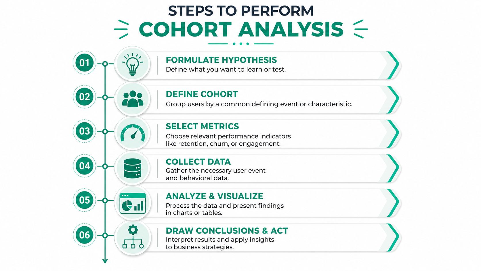
A practical workflow
Write the question clearly: “Why is retention down?” is too loose. “Did users acquired after the new signup flow retain better by month one?” is much better.
Choose the cohort definition. Match the cohort to the question. If you’re testing a product change released on a date, acquisition cohorts usually make sense. If you’re studying activation, behavioral cohorts may fit better.
Pick one metric that settles the question. Retention, churn, engagement, revenue, or upgrade rate can all work. Don’t track five metrics if one will decide what to do next.
After that, collect the event data you need, build the cohort table, and compare groups at equal lifecycle intervals.
A quick visual walkthrough helps here:
Build the table and read it properly
Rows hold the cohorts. Columns hold time since the starting event. The cells show the chosen metric for each period.
When reading the table, look for patterns like these:
- Newer rows improving means recent cohorts may be stronger
- Sharp early drop-offs often point to onboarding or first-use friction
- A shared dip across many cohorts can suggest a broad period issue rather than a cohort problem
That’s where context from broader site reporting helps. If you want a foundation for connecting behavior and performance data, the role of website analytics in growing your business is a practical companion.
Don’t stop at observation
A cohort chart is not the result. It’s evidence.
Once you spot a pattern, tie it to a business decision. Pause a weak channel. Test a revised onboarding step. Rework a pricing page. Change a lifecycle email. If the analysis doesn’t change a decision, it was only a reporting exercise.
Cohort Analysis Examples in Action
Theory gets clearer when you can see how different businesses use the method.
The same framework works across ecommerce, SaaS, and service businesses. What changes is the cohort definition, the metric, and the action that follows.
Ecommerce retention after a loyalty change
An online store wants to know whether a new loyalty program changed repeat purchase behavior. The cleanest setup is an acquisition cohort grouped by first purchase month, then tracking repeat purchase activity or revenue over later months.
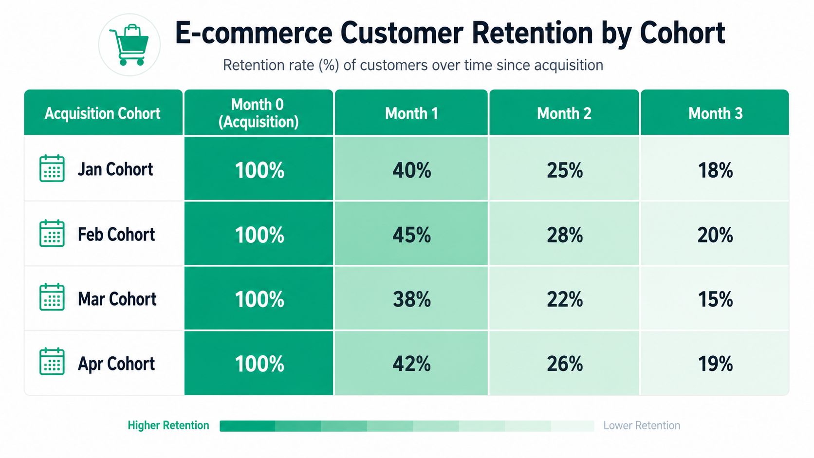
The business compares cohorts before and after the loyalty launch. If later cohorts hold up better after the first order, the program may be helping. If first-order volume rises but later retention weakens, the promotion may be attracting discount-driven buyers instead of durable customers.
That’s the kind of question tied directly to improving customer lifetime value, not just boosting short-term transactions.
SaaS upgrade behavior from early actions
A B2B SaaS company has another problem. Trial signups are healthy, but paid upgrades are uneven. Looking at overall conversion by month doesn’t show much.
So the team creates behavioral cohorts. One cohort includes users who complete a key setup step early. Another includes users who don’t. Then they track upgrade behavior over the following periods.
This doesn’t just identify who converts. It reveals which action seems to separate stronger users from weaker ones. That gives product and lifecycle teams something concrete to test, such as simplifying setup or changing trial messaging.
The best SaaS cohort analyses usually focus on one early behavior that signals whether the product clicked for the user.
Service business lead source quality
A local or regional service company often has a simpler but very useful question. Which lead source creates better long-term customers?
The cohort setup can be based on initial lead source or first closed-job month, then tracked for repeat bookings, follow-up work, or revenue over time. Google Ads leads may close fast but fade. Local SEO leads may start slower but produce stronger ongoing value. Referral leads may behave differently again.
Basic lead counts won’t show that. Cohort analysis will.
That’s why this method isn’t only for software companies. Any business that wants to compare customer quality over time can use it.
Common Pitfalls and Recommended Tools for SMBs
A small business can build a clean-looking cohort chart and still make the wrong decision from it. I see this happen when teams rush from a business question to a dashboard without checking whether the underlying data can support that comparison.
The errors usually fall into three buckets: poor cohort design, uneven time windows, and overconfidence in messy tracking.

Mistakes that distort the result
Some problems show up again and again.
Mismatched cohort definition: If the question is about onboarding quality but the cohort is grouped by geography, the chart can look polished while answering the wrong business question.
Uneven comparison windows: New cohorts have had less time to mature. Compare cohorts at the same age, such as 30 days after signup or 90 days after first purchase, instead of comparing them in the same calendar month.
Overreading incomplete data: Privacy settings, consent rules, device switching, and disconnected systems break user histories in ways that are easy to miss.
A concrete example helps here. Say an ecommerce business acquires a customer through a paid social ad on mobile, but the customer later buys on desktop after clicking an email. GA4 may record the purchase, the email platform may record the click, and the CRM may store the customer record under a different identifier. If the analyst builds a cohort around first-session source and then reads later revenue as exact by channel, the chart will overstate certainty. In that case, cohort trends can still be useful, but they should be treated as directional unless the business has a reliable way to connect those identities.
Clear cohort rules and honest caveats beat a flashy dashboard every time.
Tools that fit most SMB teams
SMBs do not need a large analytics stack to do this well. They need tools that match the question, the volume of data, and the quality of their identifiers.
Google Analytics 4 plus a cohort table in Sheets or Excel
Google Analytics 4 works well for acquisition-date cohorts and return behavior if your setup is clean. Use the Retention overview and User acquisition reports to spot broad patterns, then export the data if you need a clearer cohort table than the standard interface provides.
Google Sheets or Excel is often the practical next step. A simple template with cohort month in rows, months since acquisition in columns, and a pivot table feeding a heatmap is enough for many service businesses, local businesses, and smaller ecommerce teams. Functions like QUERY, COUNTIFS, and SUMIFS in Sheets are usually enough to build repeat-purchase or lead-to-close cohort views without buying another tool.
This setup works best when:
- The start event is easy to define, such as first purchase, signup, or closed job
- The metric is narrow, such as repeat orders, booked appointments, or return sessions
- Someone on the team can check exports manually and catch tracking issues before people act on the chart
Product analytics tools for behavioral cohorts
If the business depends on product usage, Mixpanel, Amplitude, and Heap make behavioral cohorts easier to maintain. They are better suited for questions like which early actions correlate with retention, which feature path leads to upgrade, or how users from different acquisition channels behave after signup.
The advantage is not just prettier reporting. These tools let teams define cohorts around events, then compare retention, conversion, and pathing without rebuilding the same logic in a spreadsheet every week.
Working in a fragmented-data world
Fragmented data changes how analysts should read cohort results. It does not make the method useless.
If website analytics, CRM records, and billing data do not line up perfectly, choose cohort definitions anchored to the system you trust most for the metric you care about. For example, if revenue in the CRM is reliable but web tracking is spotty, build revenue cohorts from the first closed deal date or the first invoice date instead of the first website visit. If app usage events are strong but attribution is weak, use cohorts to compare activation and retention patterns, then treat source-level conclusions with caution.
If your team needs help turning fragmented marketing data into decisions you can use, Ascendly Marketing can help you build clearer reporting, stronger measurement, and practical growth analysis around the metrics that matter.