

Over 58% of global web traffic now comes from mobile devices, which means most visitors meet your business on a phone first, not on a desktop (BrandLume). That changes the whole conversation around mobile website optimization. This isn’t a design preference. It affects whether people can read, tap, trust, and convert.
A lot of businesses still treat mobile work like cleanup. They launch the desktop site, then shrink it down and hope the menu still works. That approach usually creates slower pages, weaker search visibility, and forms that feel annoying enough to abandon.
The better approach is to treat mobile optimization like a resource allocation problem. Which fixes remove friction on revenue pages first? Which issues hurt rankings? Which changes need a developer, and which can be handled in your CMS today? That’s where small and mid-sized businesses usually win. Not by chasing every score, but by fixing the right things in the right order.
Your Mobile Audit Blueprint
Google changed the stakes when it moved to mobile-first indexing. In 2018, Google began rolling out mobile-first indexing, meaning that for most sites, the primary content and ranking signals are now based on the mobile version of the page rather than the desktop version. This shift formally transformed mobile optimization from a UX consideration into a core SEO and ranking factor (SE Ranking).
A proper audit needs three lenses at once. Performance, because slow pages lose impatient users. User experience, because mobile visitors need clear hierarchy, readable copy, and buttons they can tap without effort. Technical SEO, because Google has to crawl, render, and understand the same core content your customers see.
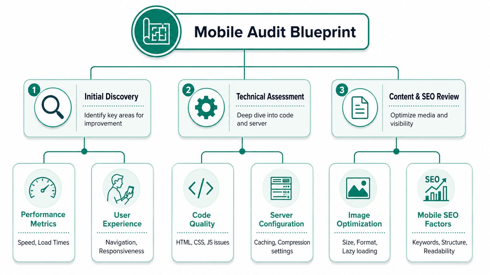
Start with the pages that matter
Don’t audit the whole site in a random order. Pull the pages that drive leads, sales, and branded search demand first. That usually means homepage, key service pages, top category pages, high-traffic blog posts, and core landing pages.
If you need a fast way to map your site before digging in, use a page inventory method like finding all pages in a website. That gives you a clean starting list instead of relying on navigation alone.
Then run those pages through:
- PageSpeed Insights for Core Web Vitals and page-level opportunities
- Lighthouse for a lab-based view of speed, accessibility, and SEO
- Google Search Console for mobile usability issues and indexing patterns
- Real-device checks on an iPhone and Android phone, because lab tools won’t show every tap or layout problem
Separate signal from noise
A business owner doesn’t need a long spreadsheet full of technical warnings. They need a punch list tied to outcomes.
Look for these issues first:
- Large media files that delay the first useful view of the page
- Layout shifts that move buttons and forms while a user is trying to interact
- Navigation friction such as oversized menus, broken sticky headers, or search obscuring the screen
- Content gaps on mobile where important copy, reviews, FAQs, or product details disappear
- Mobile SEO errors such as blocked resources, poor viewport setup, or inconsistent metadata
Practical rule: If a visitor can’t quickly understand the offer, navigate the page, and complete the next step with one thumb, the audit isn’t finished.
Strong audits also check visual hierarchy. If you want examples of how layout decisions affect mobile behavior, explore lnk.boo’s design strategies and compare them against your own landing pages. The contrast usually makes weak sections obvious fast.
Build a punch list you can act on
The best audit output is short. Use three columns: issue, impact, effort. A seven-item list that gets fixed beats a fifty-item report that sits untouched.
Ask direct questions while reviewing each page. Does the main headline fit without awkward wrapping? Does the primary call to action stay visible? Does the form keyboard match the field type on mobile? Those checks sound small, but they often reveal why traffic isn’t turning into leads.
Prioritizing Fixes for Maximum Impact
Most audit reports fail at one point. They dump every issue into a backlog and treat them as equal. They’re not equal.
A 2023 HTTP Archive analysis of over 10 million mobile pages found that only about 25% of origin sites pass all three Core Web Vitals thresholds, which tells you most businesses still under-optimize the fundamentals (Symphonic Digital). That’s useful because it narrows the field. You don’t need exotic tactics first. You need the work that clears common blockers.

Fix revenue pages before low-value pages
If your contact page, service page, product page, or quote form performs poorly on mobile, start there. A polished careers page won’t offset a broken lead form.
I usually group fixes into three buckets.
| Domain | What to look for | Why it matters |
|---|---|---|
| Performance | heavy images, render-blocking CSS or JavaScript, slow first paint | visitors stay long enough to engage |
| UX | cramped tap targets, hard-to-read text, awkward forms, sticky elements covering content | users can actually complete actions |
| SEO | mobile rendering issues, missing parity, crawl problems, weak metadata presentation | pages keep earning visibility |
Take the high-impact, low-effort wins first
Some mobile improvements don’t need a rebuild. They just need discipline.
- Compress images first: Convert oversized hero images and product images to lighter formats where your stack supports them. This often removes weight from the page without changing design.
- Fix tap targets and spacing: Buttons that sit too close together create accidental taps and lost form submissions.
- Use responsive layout systems: CSS Grid and Flexbox usually clean up broken stacks faster than patching fixed-width blocks.
- Defer non-essential scripts: If a script doesn’t help the first screen load or the first interaction, it shouldn’t compete with them.
- Trim mobile popups: Many sites bury the content under chat widgets, promos, cookie banners, and newsletter boxes on small screens.
The smartest fix isn’t the most technical one. It’s the one that removes friction from the page people use to buy, call, or submit a form.
Know where deeper work pays off
Some problems sit below the surface. These are worth prioritizing when your key pages already convert, and you want to improve speed, stability, and search performance together.
That work often includes:
- Inlining critical CSS so the first visible section renders faster
- Reserving space for dynamic elements so layouts stop jumping
- Reducing third-party code from tools that add tracking but slow interaction
- Improving caching and compression at the server or CDN level
What usually doesn’t work? Redesigning the whole site before proving where the friction is. Teams spend time changing colors, swapping fonts, and rebuilding sections that weren’t causing the problem. Mobile website optimization works better when each fix ties back to a user action, not a design preference.
Mastering Mobile-Specific SEO
A mobile page can look fine and still underperform in search. That happens when the mobile version hides content, strips structured data, or simplifies templates so aggressively that Google sees a weaker page than desktop users do.
That’s why responsive design with a correctly configured viewport meta tag has become the safer architecture choice. A 2022 Google Developers recommendation emphasizes that sites using responsive design with a correctly configured viewport meta tag achieve 20–35% faster perceived load and 15–30% higher conversion rates on mobile compared with legacy fixed-width or separate-m-site approaches (seoClarity).
Keep content parity intact
If your desktop service page includes testimonials, FAQs, pricing context, and trust elements, don’t hide those on mobile just to make the page look cleaner. Google indexes the mobile experience. If the mobile page is thinner, the page’s search value can drop.
This doesn’t mean mobile pages should be long and cluttered. It means core information should remain present, even if the design changes. Use accordions, tighter spacing, and better hierarchy rather than deleting useful content.
A good rule is simple. If the content helps someone decide, compare, or convert, keep it available on mobile.
Structure pages for mobile discovery
Mobile SEO isn’t only about rankings. It also affects how your result appears and whether people choose it on a small screen.
Focus on:
- Clear title tags and meta descriptions that communicate intent fast
- Structured data for products, services, FAQs, reviews, and local business details when relevant
- Readable headings that match the questions users ask
- Internal links that help Google understand page relationships without forcing users through deep navigation
If you want a stronger foundation on the technical side, this guide on technical SEO and site performance is a useful companion.
Mobile SEO works best when the mobile page keeps the same business value as the desktop page, then presents it with less friction.
Avoid old mobile patterns
Separate mobile URLs, stripped-down m-dot experiences, and desktop-only content modules often create maintenance problems. You end up managing parity issues, inconsistent canonical logic, and pages that don’t age well when the site changes.
Responsive design usually keeps the stack simpler. One URL. One core content set. Fewer chances for mobile and desktop to drift apart.
For local and service businesses, this matters even more. Mobile visitors often need direct actions. Phone number, location, service area, hours, core offer, and contact path should all be accessible without hunting through tabs or tiny menus.
Validating Changes with Real-World Testing
A stronger audit score does not guarantee more leads from mobile traffic. I’ve seen pages improve in Lighthouse, then lose conversions because the call button sat too close to the menu, the form jumped when the keyboard opened, or the checkout CTA dropped below the fold on a smaller device.
Real validation checks whether the page still works under normal conditions for actual customers. For an SMB, that means testing the paths tied to revenue first, not trying to QA every page equally on day one.
Start with a visual benchmark.

Test in layers, with priority pages first
Use testing in layers so each method catches a different class of issue.
- Lighthouse before and after: Compare the same key pages for performance, accessibility, and technical regressions
- Chrome DevTools device simulation: Review breakpoints, touch targets, viewport behavior, and slower network conditions
- Physical phone testing: Check the site on current iPhone and Android devices, plus at least one older phone if your audience skews budget-conscious
- Form and conversion-path testing: Complete every lead form, click-to-call action, booking flow, cart step, and thank-you page on mobile
The order matters. Start with the pages that drive calls, quote requests, booked appointments, or sales. A service business usually gets more value from testing its contact, service, and location pages thoroughly than from spending the same time on a low-traffic blog template.
Small failures cause measurable drop-off. Sticky headers can cover the first form field. Autofill can break label placement. The wrong input type can force a full keyboard where a numeric keypad should appear. Promo fields can push the purchase button out of view.
Test under the conditions customers actually use
Office Wi-Fi hides too much. Use throttling and test on cellular when possible.
Check the page load in sequence and watch for the moments that create friction:
- Does the primary headline appear fast enough to confirm the visitor is in the right place?
- Does the main CTA stay visible and tappable as the page settles?
- Do images or banners shift the layout after a user is ready to act?
- Can someone complete the form while the on-screen keyboard is open?
- Does tap behavior work cleanly with one thumb on a smaller screen?
A mobile page has passed testing when a person outside the build team can complete the main task on a real phone without hesitation.
This short video is a good refresher on how mobile-first thinking affects website behavior and user expectations.
Validate by template and by business value
Do not stop at the homepage. Test one representative page from each template that supports a meaningful business action:
- lead generation page
- e-commerce product page
- category or collection page
- long-form article
- contact or quote page
This approach helps SMBs use time well. If one template issue affects fifty service pages, fixing that template usually produces a larger return than polishing a single page in isolation. That is the difference between a technical checklist and a mobile optimization process tied to business impact.
Measuring Success with Business-Centric KPIs
A cleaner Lighthouse report feels good. It doesn’t tell you whether the work produced more calls, form submissions, or sales. The KPI set should stay tied to business outcomes, with technical metrics acting as supporting evidence.
Segment mobile traffic in your analytics platform and compare performance before and after changes on the pages you optimized. Keep the view simple enough that a business owner can read it in a minute.
Track the metrics that connect to action
Use this table as a working dashboard.
| KPI | What It Measures | Goal After Optimization |
|---|---|---|
| Mobile conversion rate | How often mobile visitors complete a lead or sale action | Upward trend on key landing pages |
| Bounce rate on mobile landing pages | Whether visitors leave before engaging | Lower friction on primary entry pages |
| Mobile form completion | Whether users can finish the lead path | More completed submissions |
| Mobile session engagement | How well visitors interact with content | Stronger page consumption and next-step clicks |
| Organic mobile entrances | Search visibility reaching the right pages | More qualified visits to optimized pages |
| Revenue or lead value from mobile | Business impact from mobile sessions | Clear growth tied to priority pages |
Compare by page group, not just sitewide
Sitewide averages blur the result. Break reporting into groups such as service pages, product pages, blog content, and branded landing pages. That helps you see where changes moved performance.
For example, a blog template update may improve engagement, while product pages still need work. Or a contact form fix may improve lead completion even if the rest of the site barely changes. That kind of reporting gives you a roadmap for the next sprint.
If your reporting setup needs structure, this guide on SEO reporting for business decisions can help you turn raw platform data into a usable scorecard.
Keep technical and business metrics side by side
One line on the dashboard should show the technical shift on each page group. Another should show what happened to leads, sales, or assisted conversions. That pairing keeps everyone honest.
A page getting faster matters because users can act faster. A cleaner layout matters because more people finish the form. Mobile website optimization should always end in that kind of sentence.
Maintaining Peak Mobile Performance
Mobile performance slips through routine growth, not just major redesigns. A new tracking script, a heavier hero image, a chat widget, or a plugin update can slow key pages enough to reduce form completions and sales. For SMBs, the primary challenge is not finding more fixes. It is protecting the gains that already improved revenue.
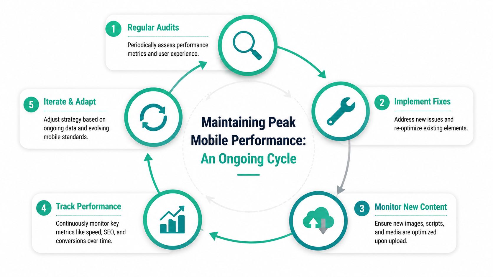
Build a maintenance rhythm
The best process is simple enough that your team will follow it. In practice, that means folding mobile checks into publishing, campaign launches, and site updates instead of saving them for a quarterly cleanup.
A workable rhythm looks like this:
- Audit priority pages on a schedule using Lighthouse, PageSpeed Insights, and manual checks on real phones
- Review scripts, plugins, and apps before launch to confirm they support lead generation, sales, or required site functions
- Set media rules at upload so oversized images and autoplay assets do not reach production
- Check conversion pages first after campaign launches, especially forms, product pages, and checkout steps
- Retest after template or design changes because small front-end edits can create tap target, layout, or speed issues
Prioritization matters again. A local service business does not need to monitor every page with the same intensity. It needs tighter controls on the pages that book calls, capture leads, and generate revenue.
Use staged rollout when the risk is high
Some changes deserve a slower release process. Form rebuilds, navigation updates, checkout edits, and JavaScript-heavy features can affect both usability and conversion rate in ways that are hard to spot in a desktop review.
Roll out those changes on a limited page set first. That gives your team a cleaner read on what changed. If mobile conversions drop, troubleshooting is faster. If performance holds or improves, you can expand the update with less risk.
I recommend treating high-intent mobile pages like controlled environments. The homepage can tolerate more experimentation than a quote form or checkout flow.
Treat mobile maintenance as quality control for revenue pages, not a background technical task.
Set rules your team can follow
Performance budgets work best as operating rules, not developer jargon. Set clear limits for image file size, total page weight, third-party scripts, and template complexity. Then make those limits part of the approval process for content, design, and marketing teams.
That creates accountability across departments. Editors know what image specs to use. Paid media teams know how much script weight a landing page can carry. Developers know which third-party tools need review before they go live.
Without those guardrails, mobile performance usually declines one small decision at a time. The businesses that hold their gains treat mobile optimization as an ongoing operating standard tied to leads, sales, and customer experience.
Answering Your Mobile Optimization Questions
What if your site runs on WordPress or Shopify
You still have room to improve. Platform-based sites often struggle because of theme bloat, plugin overload, oversized media, and apps that inject extra scripts. Start by auditing the active theme, removing anything unused, and checking whether each plugin or app contributes directly to sales, lead generation, or required functionality.
On WordPress, page builders and plugin stacks are common culprits. On Shopify, theme customizations, apps, and image-heavy product templates often create the friction. In both cases, template discipline matters more than platform loyalty.
Does AMP still deserve attention?
For most businesses, the stronger priority is a fast, stable mobile site with solid Core Web Vitals, clean rendering, and a simple responsive framework. AMP no longer needs to sit at the center of a mobile strategy for typical SMB lead generation or e-commerce use cases.
If a business already has AMP in place and it performs well, there may be no reason to rip it out immediately. But if you’re deciding where to invest next, improving the main mobile experience usually has broader value.
How do you balance visual design with speed?
Don’t frame this as beauty versus performance. The better question is which visual elements help a user decide and which ones consume bandwidth.
Keep the visuals that support trust and action. Product imagery, before-and-after examples, team photos, and clear icons can all help. Remove motion that delays interaction, trim decorative assets that don’t support the message, and make sure the first screen loads with clarity.
How often should you revisit mobile optimization?
Revisit it whenever you change templates, add new tools, launch campaigns, or notice a drop in mobile leads or sales. Outside of those moments, review your top mobile pages on a recurring schedule and test the most valuable journeys on real devices.
Mobile optimization works best as a loop. Audit, prioritize, fix, validate, measure, repeat.
If your team wants help turning mobile traffic into more qualified leads and revenue, Ascendly Marketing can help you audit the right pages, prioritize fixes by business impact, and build a mobile site that supports growth instead of slowing it down.