

LinkedIn engagement rate is the share of viewers who interacted with a post. In 2026, the platform average sits around 5.2% to 6.5% depending on methodology, and 2% to 5% is generally healthy for company pages.
A lot of guides stop there and leave readers with a number that looks precise but behaves differently from tool to tool. That’s where people get tripped up. The math changes with the denominator, so the benchmark changes with it too.
What LinkedIn Engagement Rate Actually Measures
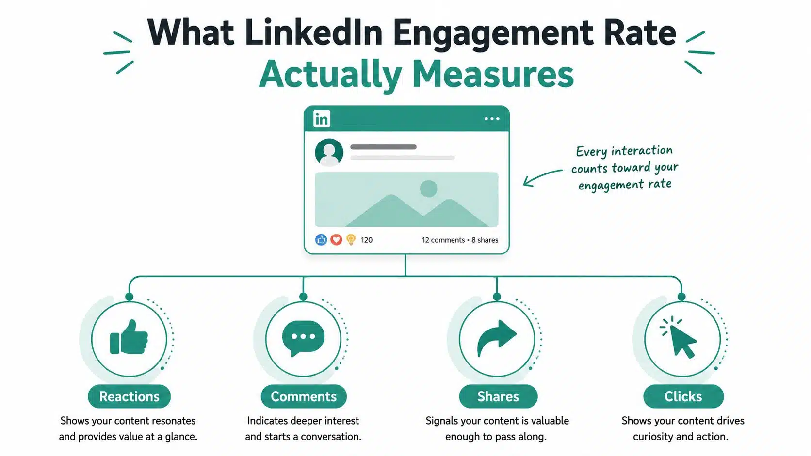
LinkedIn engagement rate measures how often people who saw a post took some action on it. Those actions usually include reactions, comments, shares, clicks, and sometimes follows, depending on the reporting tool. That means the metric is not a popularity score in the abstract; it’s a response rate tied to exposure.
Why impressions are the cleanest denominator
The best denominator for feed optimization is usually impressions, because it measures how many times the post was shown. That matters more than follower count when you want to know whether the content resonated with the audience that saw it. Sprout Social uses the same logic in its formula: (total engagements ÷ total impressions) × 100 (Sprout Social’s LinkedIn engagement rate guide).
If a post reaches fewer people but gets a stronger response, the impressions-based rate will show that clearly. If you divide by followers instead, the picture gets fuzzy, because many followers never see the post at all. LinkedIn’s own guidance frames engagement rate as the share of people who interact relative to those who saw the content, which is why impressions-based reporting works better for post testing (LinkedIn engagement rate guidance).
A simple example with two posts
A small B2B company posts two updates. One gets 800 impressions and a strong comment thread. The other gets 3,000 impressions but almost no response. The second post may have bigger raw exposure, but the first one can easily win on engagement rate if it generates more interactions per impression.
That’s the part junior marketers usually miss. Raw engagement volume tells you how many actions happened. Engagement rate tells you how efficiently the post turned views into action.
Practical rule: Compare posts by the same denominator every time. If one report uses impressions and another uses followers, the numbers can’t sit in the same ranking without distortion.
For a clean target list of LinkedIn accounts and post types to benchmark against, the Scrapeway target for LinkedIn is a useful reference point when you’re organizing outreach or research.
The Two Formulas Most Teams Use and How to Calculate Them
Two formulas show up most often in LinkedIn reporting. The first is the impressions-based formula, which is the one LinkedIn and Sprout Social use. The second is the followers-based formula, which Hootsuite presents as total engagements ÷ followers × 100 (Hootsuite’s average engagement rate guide).
Impressions-based formula with a worked example
Use this when you want to measure post performance.
Formula: total engagements ÷ total impressions × 100
Say a post gets 42 engagements and 1,000 impressions. The calculation is 42 ÷ 1,000 × 100 = 4.2%. That number tells you how often viewers acted after seeing the post, which is why it works well for content testing and feed optimization.
This is the formula to use when you compare hooks, formats, and topics. It isolates the content itself more cleanly because impressions reflect what LinkedIn distributed.
Followers-based formula with a worked example
Use this when you want a broader audience-health snapshot.
Formula: total engagements ÷ followers × 100
Say a company page has 2,000 followers and a post gets 42 engagements. The calculation is 42 ÷ 2,000 × 100 = 2.1%. That sounds lower, but the denominator is much larger, so the result answers a different question.
This formula can be useful for account-level reporting, especially when a team wants to know whether a page’s follower base is active over time. It’s not the best choice for post-by-post creative decisions, because it assumes follower visibility that LinkedIn doesn’t always deliver.
The reporting mistake that causes the most confusion
The biggest error is mixing denominators in one dashboard. A report might rank one post using impressions-based engagement and another using follower-based engagement, then compare them as if they mean the same thing. They don’t.
A clean report uses one formula for one purpose. If the purpose is content testing, keep the denominator on impressions. If the purpose is audience health, keep it on followers.
That’s also why different tools can produce different answers for the same post. The metric looks familiar, but the math under it has changed.
2026 Benchmarks and Why the Numbers Conflict
A LinkedIn engagement rate is only useful if you know what sits under the number. The confusion around 2026 benchmarks comes from the fact that different publishers are not measuring the same denominator, or even the same engagement set. Some reports use impressions, some use followers, and some include clicks while others leave them out. The averages can look inconsistent on the surface, while the math underneath is different.
The historical trend matters because it shows the range is moving, not settling. In July 2024, LinkedIn page posts averaged 4.8% engagement worldwide in a LinkedIn Pulse analysis by Xavier Degraux (LinkedIn Pulse analysis). Buffer later reported an average of 6.50% and said LinkedIn was the highest-engagement major social platform in its 2025 benchmark data (Buffer LinkedIn statistics). A separate benchmark range for 2026 places LinkedIn around 5.2% to 6.5%, depending on methodology (LinkedIn benchmark discussion).
That spread is not a warning sign. It tells you the benchmark is sensitive to how the sample is built, how the formula is defined, and which kinds of accounts dominate the dataset. A page that serves a broad B2B audience will not read the same way as an account built around a narrow industry niche, even if both are healthy.
Raw engagement volume also moved up
The rate did not rise in isolation. Statista reported that the average LinkedIn post received 11.32 engagement instances in 2024, up from 8.75 the year before, which is roughly 29% higher (Statista LinkedIn post engagement). Posts were not only producing stronger rates, but they were also collecting more total actions. For planning, that matters because a higher rate with flat volume can still leave a client with limited reach, while higher total interactions can support stronger lead flow and sharper audience learning.
Statista also noted that the United States remained the largest LinkedIn audience, followed by India and Brazil (Statista LinkedIn post engagement). That matters when you are comparing your account to a public benchmark. A global average can hide regional behavior, and a client with a concentrated market footprint may need a benchmark that reflects that mix instead of the platform overall.
Why the headline number keeps shifting
Different benchmark sources use different rules. LinkedIn and Sprout Social emphasize engagements relative to impressions (LinkedIn engagement rate guidance, Sprout Social). Hootsuite presents a followers-based approach (Hootsuite). Meet-lea notes that company pages often sit in a 2% to 5% healthy range, while personal profiles tend to run higher (Meet-lea benchmark guide).
That is why benchmark reading has to start with method, not with the biggest number on the page. Use one formula, state it in the report, and compare like for like. If a client asks why a rival report looks better, the first question should be whether the denominator matches. If it does not, the numbers are answering different questions.

One more point matters for 2026 planning. The trend from 2024 to 2026 suggests LinkedIn engagement is not a fixed platform constant; it is a moving range shaped by content mix, distribution, and audience composition. A team reporting to stakeholders should treat the benchmark as a planning band, then judge whether the account is trending up, holding steady, or slipping inside that band. That is also why a B2B lead generation LinkedIn strategy should be judged against the account’s own history first, then against external averages.
How Engagement Shifts by Industry, Audience Size, and Post Format
A LinkedIn engagement rate only makes sense when you place it beside the conditions that shaped it. Format, audience mix, and account type all change the denominator of reality, even if the report line looks simple.
Format changes the result fast
Post format is usually the first place to look because it changes how people behave on the feed. Socialinsider’s benchmark data shows a clear ladder across formats. Multi-image posts average 6.60%, native documents average 6.10%, video posts average 5.60%, and polls reach 4.40% (Socialinsider LinkedIn benchmarks). A spread like that can move a monthly average enough to change the story you tell a client, even if the content team did not change its topic.
Native documents appear near the top in another benchmark summary as well, which reports 7.00% and a 14% year-on-year increase for that format (Socialinsider benchmark summary). The exact number shifts by source, but the direction stays useful. Document-style posts tend to hold attention longer because they ask for a more deliberate action than a quick scroll past a text update.
That is why format should be part of the benchmark conversation, not an afterthought. If a client keeps publishing text-heavy updates and wonders why engagement feels muted, the format mix may explain more than the topic does.
Audience size changes the baseline
Audience size affects how often a post gets a reaction, but it also changes what “good” looks like. Brand pages often sit below creator-style accounts because a broader follower base usually includes many people who rarely engage. One benchmark source places median brand engagement per follower at 0.41% (Statista LinkedIn post engagement). That figure is not a ceiling; it is a reminder that brand pages and personal profiles rarely play the same game.
A smaller audience can post a higher engagement rate because the content lands closer to daily work. A larger audience can still be healthy if it brings reach, pipeline, and qualified attention. The metric should be read alongside the account’s purpose. A recruiting page, a founder profile, and a product brand page may all report different engagement patterns for reasons that have nothing to do with content quality alone.
Industry comparison works best as a directional check
Industry benchmarks vary by source, so the safer move is to compare like for like before you treat sector averages as a verdict. A B2B software page should not be judged against a creator profile that posts personal commentary, just as an e-commerce brand should not be measured against a niche professional services page without first checking the formula and account type. Industry can still help, but only as a directional check after the baseline is aligned.
A useful way to think about it is simple. First, ask whether the account is a brand page, a creator profile, or a hybrid. Second, ask whether the post mix is mostly documents, video, polls, or plain text. Third, ask whether the audience is narrow and specialized or broad and mixed. Once those three answers are clear, sector comparisons become more honest and far more useful for reporting.
Useful check: Benchmark against your own account type first, your audience size second, and the wider platform average last.
For a practical example of how B2B lead generation teams can connect content and audience growth, see this LinkedIn lead generation framework. Teams using automation should also be careful about how they interpret engagement from assisted outreach. A tool such as Dooza LinkedIn lead generation agents may help increase activity, but the report still needs to separate assisted interactions from organic post performance.
Tracking Engagement Inside LinkedIn and With Third-Party Tools
LinkedIn Page Analytics gives you the raw material, but the Posts tab only helps if you know what each metric means. Open your Page admin view, go to Analytics, then Posts. From there, review each post’s impressions and engagement actions, because those are the figures you need for the impressions-based formula described earlier.
What to pull from LinkedIn first
Start with the post-level rows. You’re looking for impressions, clicks, reactions, comments, and shares. If your tool also records follows from post activity, keep them in the same export and note the inclusion rule in the report.
That small note avoids a lot of confusion later. A team can look at two exports, both labeled engagement, and still have different math under them if one includes follows and the other doesn’t.
Where third-party tools help
Third-party tools matter when you need history, competitor context, or multi-account reporting. Sprout Social is useful for structured post reporting and exports, Hootsuite for follower-based reporting, Buffer for benchmark context, and Socialinsider for format comparisons and platform-level benchmarking. Each one gives a slightly different lens, so the value comes from choosing the lens that matches the question.
If your team manages multiple clients, tool choice also affects cadence. A weekly export from LinkedIn can feed a monthly summary. A monthly benchmark refresh keeps the team honest about shifts in the platform. A quarterly formula audit catches the reporting drift that happens when someone changes a dashboard setting and forgets to mention it.
For agencies that need to map social work to lead flow, Dooza LinkedIn lead generation agents can help frame how automation and outreach fit into a broader reporting stack.
Practical routine: Export weekly, refresh benchmarks monthly, and audit the formula every quarter.
You can pair that routine with a broader social media audit process to keep LinkedIn reporting aligned with the rest of the channel mix.
A Reporting Template That Turns Engagement Into ROI
Engagement rate by itself doesn’t answer the client’s main question, which is whether the work supports pipeline. The report has to connect the metric to business movement, even if the relationship is indirect. That means keeping the engagement figure, but surrounding it with click-through paths, assisted conversions, and the content themes that produced them.
A simple template to reuse each month
Use one section for performance, one for interpretation, and one for next actions.
- Performance: Total impressions, total engagements, engagement rate, top-performing post formats, and the posts that produced the most comments or clicks.
- Traffic path: UTM-tagged visits from LinkedIn, landing page behavior, and assisted conversions tracked through the LinkedIn Insight Tag.
- Business outcome: Pipeline influenced, revenue influenced where attribution is available, and the cost per engagement if paid amplification was used.
That layout keeps the report readable. It also keeps the engagement rate from floating alone without business context.
How to connect clicks to assisted conversions
UTM parameters tell you which LinkedIn post drove the visit. The LinkedIn Insight Tag helps connect that visit to downstream behavior on the site. When a prospect sees a post, clicks through, and converts later through another touchpoint, the report can still show that LinkedIn helped start the path.
A monthly executive summary should stay short. One paragraph can say whether engagement improved, what formats drove the change, and whether those interactions reached site actions or pipeline events. Another paragraph can explain what the team will test next under the agency’s discover, plan, execute, report cadence.
If you need a reference point for how automation fits into a structured social workflow, these LinkedIn automation tools give a useful comparison set.
The cleanest executive summaries answer three questions only. What happened, why did it happen, and what gets tested next.
That discipline keeps the report tied to action instead of turning it into a dashboard dump.
Tactics That Move the Number for SMB, E-commerce, and B2B Accounts
The tactic should match the account type. A founder-led SMB page doesn’t need the same playbook as an e-commerce brand or a B2B pipeline team. The benchmark data already shows that format choice matters, so the job now is to choose the right format for the right business goal.

SMB
For smaller businesses, founder-led posting usually gives the page a more human voice. That matters because LinkedIn tends to reward person-to-person interaction more naturally than brand-only broadcasts. A founder can post a lesson, a product decision, or a client observation in a way the company page usually can’t.
If the page is still the main channel, keep the content simple and specific. A short update, a behind-the-scenes image, or a document-style post can work better than a polished announcement.
E-commerce
E-commerce teams should turn launches into native documents and multi-image posts. Those formats already sit near the top of the benchmark stack, so they give product stories a better chance of earning interaction. A carousel that shows use cases, feature details, and customer context will usually give the audience more to respond to than a flat product image.
If the goal is engagement, don’t lead with the catalog page. Lead with the story around the product.
B2B
B2B accounts should treat comments as part of the distribution strategy. Posts that invite a response, especially from subject matter experts, often keep the conversation alive longer than a simple company update. Employee advocacy helps too, because the same post can travel through several professional networks instead of one page alone.
A sensible target is to use the stronger native formats already identified in the benchmarks, then watch whether the comment thread deepens over time rather than stopping at reactions.
For a broader content system that supports these moves, see this LinkedIn content strategy guide.
LinkedIn Engagement Rate Questions Clients Always Ask
Clients usually ask the same questions once the report is on the table. The first is whether one number can work for every account. It cannot, because a company page, a founder profile, and a highly active employee network behave differently. A page with a broad audience may need a lower bar than a personal profile with a tighter, more familiar network, so the benchmark has to match the account type before it means anything.
The next question is how to explain formula differences to non-marketing stakeholders. Keep it simple, because the denominator changes the story. If one team divides interactions by impressions and another divides by followers, the same post can look stronger or weaker on paper even though the content did not change. A useful client explanation is to compare it to measuring speed by miles per hour versus miles per trip; both are valid, but they answer different questions.
Clients also ask how often the number should be reported. Weekly tracking helps you spot swings in distribution while a campaign is live, monthly reporting works better for client reviews, and quarterly reviews help you notice whether the calculation method or the audience mix has shifted. If the rate drops, start by checking whether the post reached fewer people or whether impressions moved to a colder audience before blaming the creative.
Another common question is whether a low rate means the content failed. Sometimes it does, but sometimes the post reached the wrong segment or received too few impressions to give the ratio much weight. That is why a junior marketer should always read the numerator and denominator together; the rate alone is only half the picture. A post with modest interaction can still be useful if it reached the right decision-makers or started the right comment thread.
The last question is about tooling. Third-party platforms make sense when they save manual exports, keep a historical record intact, or let you combine several accounts into one view without rebuilding the report every time. For clients who want a single universal benchmark number, give them a range tied to account type and formula, then state plainly which method you used so the comparison stays honest.
A Meet-lea benchmark guide can help you frame those comparisons, but the client conversation should still center on fit, consistency, and the reporting method behind the number.
Measuring engagement is one part of building executive authority. Ascendly’s thought leadership marketing services combine strategy, ghostwriting and reporting for founders and executives.