

You can have four dashboards open, three agencies sending reports, and a spreadsheet full of traffic numbers, and still not know what to do next. That’s the usual problem with analytics and reporting: there’s data everywhere, but the decision is still getting made by instinct, Slack threads, or whoever spoke last in the meeting.
The fix isn’t more charts. It’s a system that tells you what happened, why it happened, and which move deserves budget, time, or attention. That’s the difference between collecting numbers and running a business with them.
Why Most Businesses Have Too Much Data and Too Little Insight
A lot of teams reach the same frustrating point. The dashboard says traffic is up, conversions are flat, paid spend is higher than last month, and email engagement looks fine, but no one can explain which channel deserves the next dollar. Marketing ends up reporting activity while leadership asks for direction.
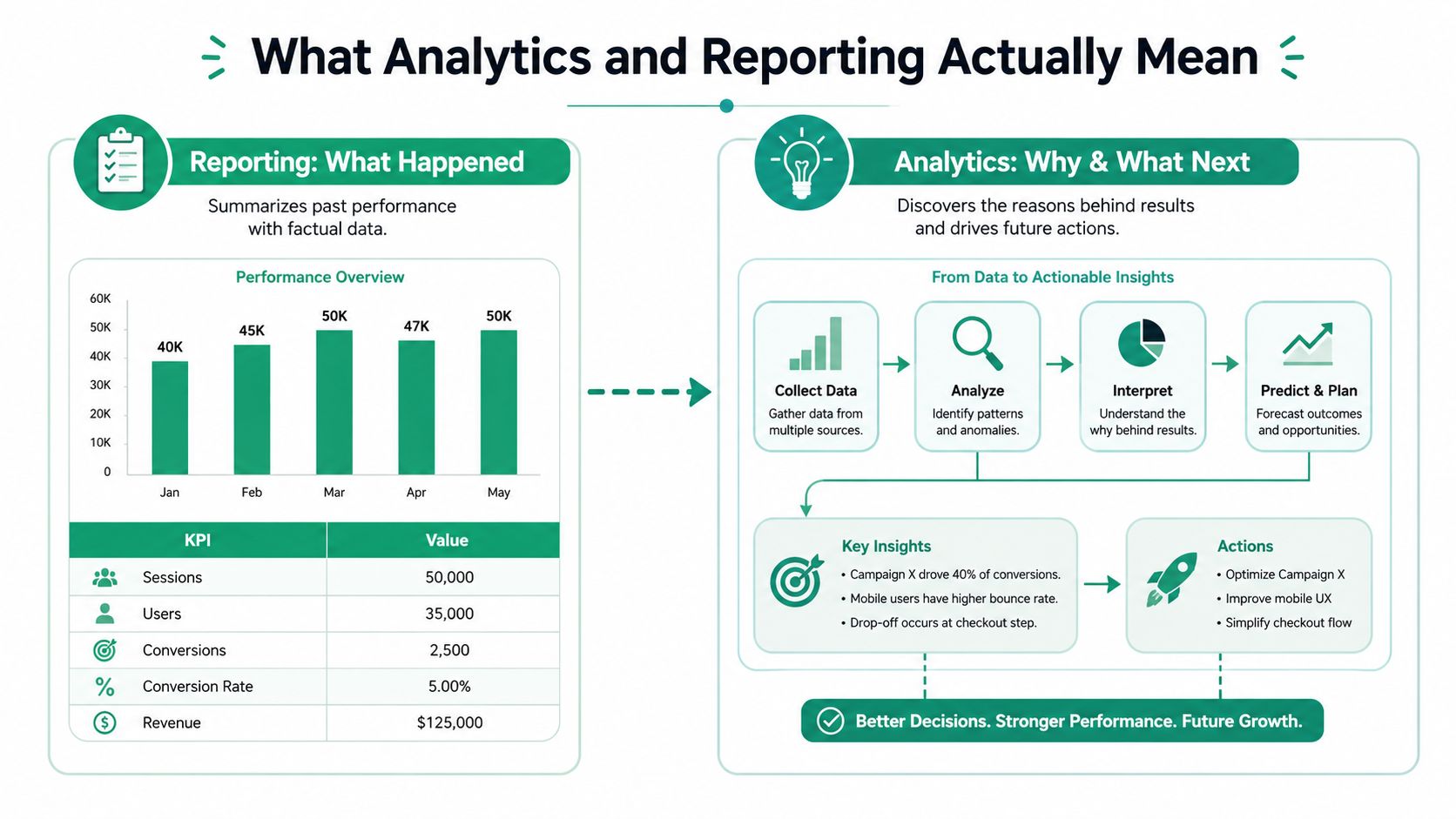
That gap is why reporting and analytics exist as separate practices. Reporting presents what happened through KPIs, charts, and tables, while analytics explains the drivers and points to action. By the early 2020s, that split had become the standard operating model for organizations, with reporting used to summarize performance and analytics used to interpret it, then translate it into next steps. A practical reporting workflow also keeps the focus on a limited set of numbers, often 5 to 8 core metrics, so the team can act without getting buried in noise. Qlik’s overview of reporting and analytics reflects that shift from static scorecards to decision support.
The cleanest way to think about it is simple. Reporting tells the team what happened last week, last month, or last quarter. Analytics answers why that pattern showed up, and what to do with it.

Practical rule: If a report doesn’t change a decision, it’s noise.
What Analytics and Reporting Actually Mean
Reporting and analytics work best as a loop, not as separate departments. Reporting gathers the facts, arranges them, and makes them visible. Analytics looks at the same facts and asks why performance moved, which segment changed, and what should happen next.
Reporting shows the state of the business
In marketing, reporting usually pulls together pageviews, sessions, unique visitors, traffic sources, bounce rate, average time on page, conversion rate, and revenue. The point isn’t to display every available metric. The point is to present the few numbers that show whether the business is moving in the right direction.
Google Analytics’ report categories, including acquisition, engagement, monetization, and retention, show how web reporting matured into a structured view of the customer journey. Google Analytics documentation also shows why web metrics are operational, not decorative. Bounce rate can flag landing-page or UX problems, and conversion rate links traffic quality to business outcomes.
Analytics explains the movement
Once the report shows the shape of performance, analytics starts separating signal from background. Did organic traffic rise because one page ranked better, or because branded search climbed after a campaign? Did paid traffic produce more sessions but weaker conversion, or did the landing page create the problem?
Keep the report small, then use analytics to dig deep only where the numbers changed.
A useful working model is straightforward. Capture the data, present the KPIs clearly, interpret the drivers, and turn the findings into next steps. That keeps the report readable for executives and still useful for the people who need to fix the work.
Core Metrics and KPIs by Channel
Different channels answer different questions, so a single dashboard template usually creates more confusion than clarity. SEO, paid search, email, and website experience each need their own primary metrics. If every channel gets the same treatment, the report fills up with weak indicators and the numbers that move revenue get buried.
| Channel | Primary KPIs | Frequency |
|---|---|---|
| SEO | Organic sessions, keyword rankings, conversion rate by landing page, organic revenue or lead volume | Weekly |
| Paid search and social ads | Cost per click, conversion rate, cost per acquisition, return on ad spend | Daily or weekly |
| Email marketing | Open rate, click rate, conversion rate, unsubscribe rate | Weekly |
| Website experience | Bounce rate, average time on page, session depth | Daily or weekly |
For SEO reporting, the most useful view connects visibility to outcome. Organic sessions and rankings show whether search performance is improving, but conversion rate by landing page tells you whether that visibility is producing leads or sales. If the rankings rise and the landing page doesn’t convert, the problem isn’t traffic; it’s page intent, offer match, or layout.
Paid media needs a different lens. Cost per click tells you the market price of attention, while conversion rate and cost per acquisition tell you whether the traffic is worth buying. Email sits in yet another category, where open rate, click rate, and unsubscribe rate say more about audience fit and message quality than pure volume does.
If you want a practical SEO reporting format, this SEO reporting guide is a useful reference point. It’s especially helpful when a client needs to see how search work ties back to leads, not just rankings.
Where Your Marketing Data Comes From
Most reporting problems start with fragmented data, not bad dashboards. Website behavior lives in analytics platforms. Ad cost and campaign performance sit inside Google Ads, Meta Ads, and other paid channels. CRM systems hold lead and customer history. Email platforms store opens, clicks, replies, and unsubscribes.
The reporting job is to connect those fragments into one view without pretending they’re identical. A session in a web analytics platform is not the same thing as a lead in a CRM, and a click in an ad platform doesn’t equal a qualified buyer. The metric definitions need to stay stable across tools, or the same team will end up arguing about what the numbers mean instead of what to do with them.
Build one source of truth per metric
Each key KPI should have a home. Revenue should come from the system of record that tracks sales, leads should come from the CRM, and traffic should come from the analytics platform. That keeps one person from updating a spreadsheet version of truth while another pulls a different figure from the dashboard.
When teams do this well, the reporting flow becomes manageable. Traffic data shows which campaigns and pages created visits. CRM data shows which visits became leads and customers. Email and ad platforms fill in the acquisition story, so the team can trace performance from channel to outcome.
Keep the joins simple
The smallest usable setup usually beats the most ambitious one. Campaign tags, consistent naming conventions, and clean source definitions do more for decision-making than a messy pile of disconnected dashboards. If a source can’t be traced to revenue or lead outcomes, it still belongs in the system, but it doesn’t belong in the main decision report.
Building Dashboards that Drive Decisions
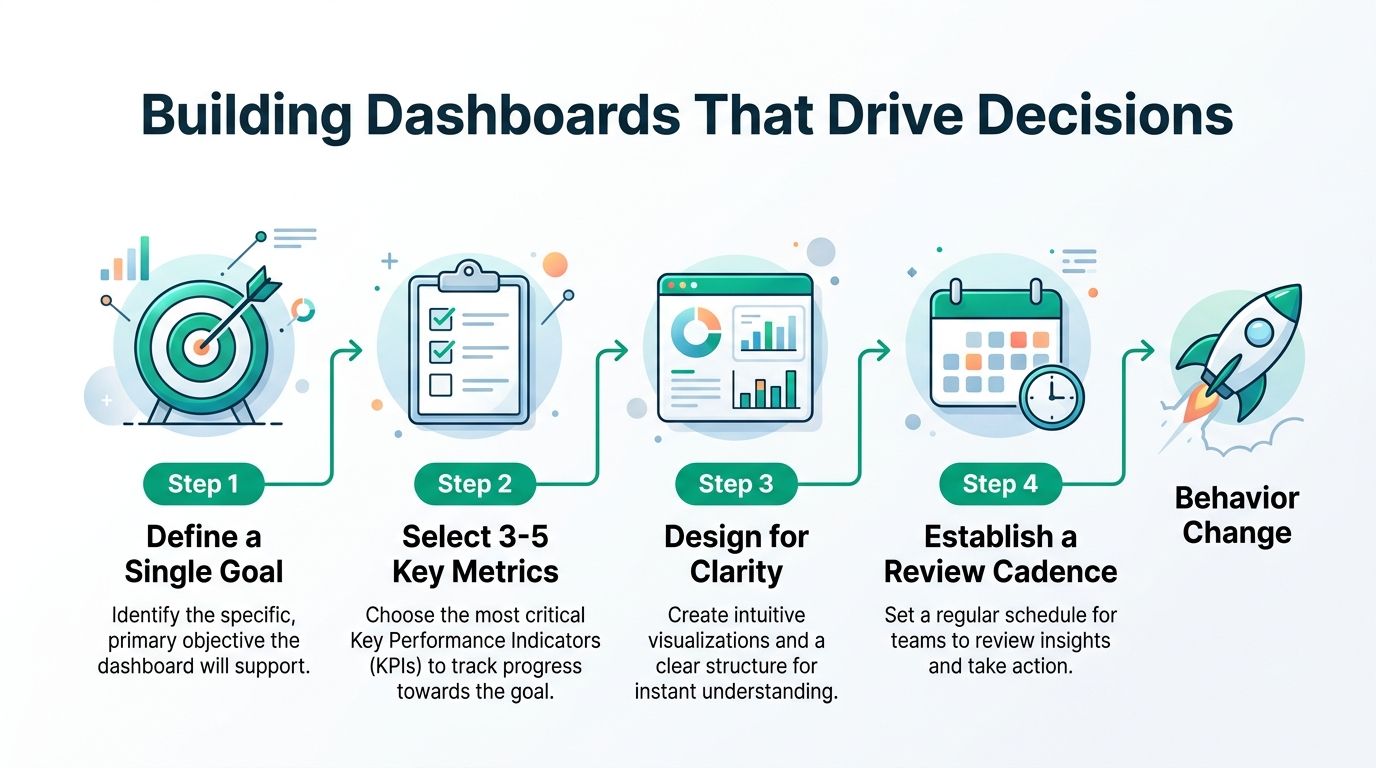
A dashboard should change what people do on Monday morning. If nobody reads it, nobody acts on it, and the report becomes a maintenance chore instead of a management tool. The fix starts with structure.
A strong analytics report should state the business question, scope, audience, key KPIs, data sources, timeframe, findings, and recommended actions. It should also disclose assumptions and limitations, because stakeholders need to know how much confidence to place in the result. FanRuan’s guidance on writing analytics reports aligns with that structure, and analytical reporting guidance from Bill.com adds a practical detail: sources should be documented with footnotes or endnotes, and electronic references should record the publication date, URL, and access date.
Use cadence to match the decision
Different questions need different rhythms. Daily reports should track spend, clicks, and immediate conversion signals. Weekly reports should look at trend movement and channel performance. Monthly reviews should connect marketing activity to revenue, lead quality, and retention. Quarterly sessions should be where budget shifts and strategy changes get discussed.
| Report Type | Frequency | Primary Audience |
|---|---|---|
| Daily operations check | Daily | Channel managers |
| Weekly performance review | Weekly | Marketing lead, growth team |
| Monthly business review | Monthly | Founders, executives |
| Quarterly planning review | Quarterly | Leadership team |
Automation helps here because it reduces manual reporting time and cuts avoidable errors. That creates more trust in the report, which usually improves adoption. A technical reporting workflow also needs documentation, including cleaning steps, methodology, and recommendations, so the work can be repeated instead of recreated.
For a useful set of layout ideas, the Sift AI dashboard examples page is worth a look because it shows how performance views can stay focused on action instead of decoration.
If you’re evaluating tools for web measurement, this website traffic analysis tools guide can help you compare reporting needs against what the tools show.
Real Examples and Template Interpretations
A report gets useful when someone can look at it and know what happens next. That usually means the story has to connect the metric, the business context, and the action. Three common templates cover most use cases.
E-commerce monthly report
A store owner doesn’t need separate tabs for traffic, ad spend, and revenue if those numbers never meet in the same view. The cleaner setup ties paid acquisition cost, conversion rate, and average order value together. If paid traffic rises but conversion rate falls, the answer may be landing-page mismatch, poor offer quality, or the wrong audience, not just a “traffic problem.”
B2B lead-generation report
A B2B team should connect marketing-qualified leads to sales-closed revenue. That makes the report useful for both marketing and sales, because lead volume alone doesn’t prove value. If MQLs rise and closed revenue doesn’t, the next question is qualification, routing, or follow-up speed.
Local service business report
A local business usually needs a simpler set of signals. Organic search impressions, local pack visibility, and phone-call conversions tell a much clearer story than raw traffic alone. If impressions climb but calls stay flat, the page may be attracting researchers rather than ready buyers, which means the offer, trust signals, or call-to-action needs work.
Practical rule: When two metrics conflict, treat the business outcome as the tie-breaker.
The best template is the one that answers a real question quickly. A monthly e-commerce review can be short. A local service report can be even shorter. The point is to keep the interpretation attached to the action, so the report doesn’t become another archive nobody opens twice.
Common Reporting Mistakes and How to Fix Them
Most reporting failures come from discipline, not software. Teams blame the dashboard when the core issue is that the dashboard is full of numbers nobody uses or trusts.
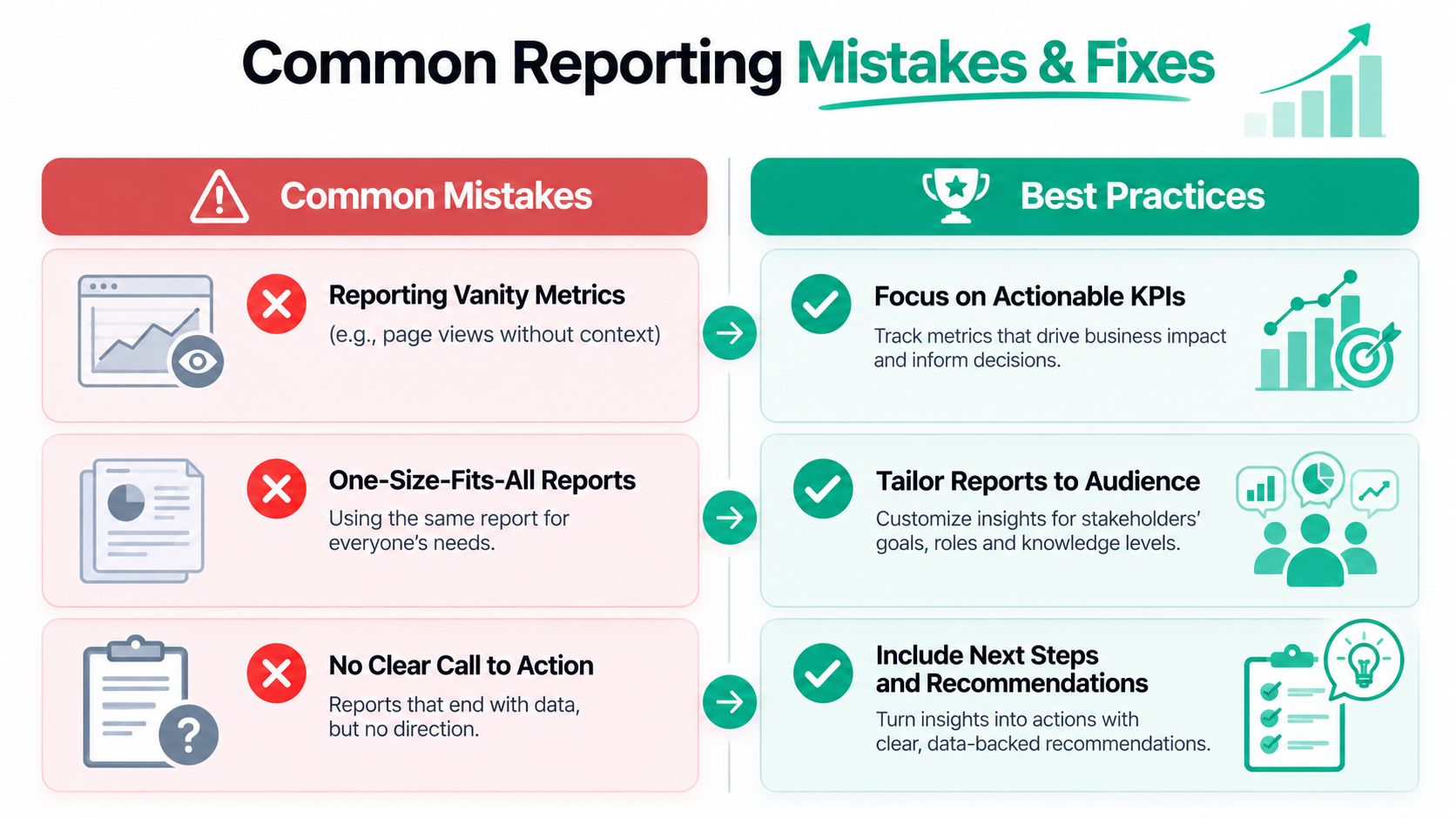
The first mistake is vanity metrics. Pageviews, likes, and broad reach can be useful context, but they don’t deserve the same weight as conversion or revenue data. The fix is to pair visibility metrics with a downstream outcome, so the report shows whether attention turned into action.
The second mistake is inconsistent definitions. Two teams can read the same dashboard and reach opposite conclusions if one counts leads differently or pulls traffic from a different source. The fix is metric ownership. One definition, one owner, one system of record.
The third mistake is the silent dashboard. Automation creates the report, but no one reviews it, so the work sits unused. The fix is a regular review cadence with a named audience and a decision tied to each meeting.
The fourth mistake is over-reporting. More rows and more charts don’t create clarity. They create fatigue. That’s where the 5 to 8 core numbers rule matters again, because the report should point people toward a choice, not give them homework.
The fifth mistake is missing data-quality checks. Reporting gets expensive fast this way. Google says 60% of organizations still struggle to access trustworthy data across systems, and IBM has estimated that poor data quality costs the U.S. economy $3.1 trillion annually. Those numbers point to a basic truth: broken inputs create confident-looking outputs that can still be wrong. Online Journalism Blog’s discussion of bad data stories captures that gap well, and TimeTackle’s agency reporting guidance is useful if you’re trying to structure reporting work across multiple clients or teams.
How an Agency Partnership Operationalizes Continuous Reporting
Building a reporting system from scratch takes time, technical alignment, and routine maintenance. For a small or mid-sized business, that work competes with campaigns, sales, product changes, and day-to-day operations. A consultative agency partnership can absorb that burden and turn reporting into an operating process instead of a side task.
A good partner starts with discovery, not dashboards. The team needs to know which business outcomes matter, who uses the reports, and which decisions need faster answers. From there, planning connects those outcomes to the right metrics and review cadence, so the report isn’t just a pile of numbers from different platforms.
Execution is where many internal teams get stuck. Tracking has to be installed correctly, naming has to stay consistent, and data sources have to be tied together without breaking the definitions. That’s the point where a website analytics agency can be useful, because the work isn’t just reporting after the fact; it’s making sure the inputs are reliable enough to trust.
The first report in a working system should stay tight. Three to five KPIs are usually enough to start if the audience is a founder, marketing lead, or client stakeholder. Add more only when a new metric changes a real decision. If no one can explain what a KPI changes, it doesn’t belong in the main report.
Missing or broken tracking data should be handled before interpretation, not after. Reconcile the source systems, check for missing fields, and compare repeated records when the same lead or user appears in more than one place. A report that looks polished but rests on bad input only creates more work later.
Review meetings need a consistent rhythm too. Small teams usually do better with a weekly performance discussion and a monthly business review than with a dozen scattered check-ins. That cadence keeps the report tied to action, and it gives the team a clear place to decide whether the numbers are improving decisions or just increasing volume.
Ascendly Marketing’s process fits that model because it combines discovery, planning, execution, reporting, and continuous optimization around measurable outcomes. That matters when the goal isn’t just cleaner charts, but better choices about budget, content, campaigns, and conversions.
If you want reporting that points to the next decision instead of another spreadsheet, talk with Ascendly Marketing. The team builds analytics and reporting systems that connect traffic, leads, and revenue, then keeps them aligned with the decisions your business has to make.