
You’re probably looking at a homepage that feels polished, but the pipeline is flat. Sales says leads are weak, marketing says the traffic is fine, and the redesign keeps drifting because everyone wants a cleaner site without agreeing on what the site has to do for a buying committee.
That split is common in website design for B2B. Buyers don’t browse a B2B site like a consumer store; they compare vendors, look for proof, and move fast if the page doesn’t answer their questions. With 94% of first impressions based on design and 75% of users judging credibility from website design, the site shapes whether the conversation starts at all, not just whether it looks modern (BusinessDasher research). The problem is that many teams start with visuals before they’ve defined the buyer, the journey, and the conversion path.
Why Most B2B Redesigns Stall Before They Ship
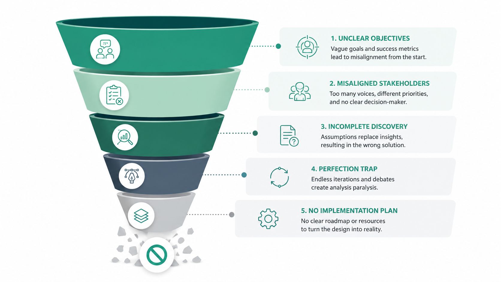
A SaaS team walks into kickoff with a familiar brief. The homepage feels dated, product pages are inconsistent, and the CEO wants a cleaner brand presence before the next sales push. The first workshop fills with mood boards, competitor screenshots, and opinions about hero animation, but nobody has named the primary ICP, mapped the buying committee, or agreed on what counts as a qualified handoff.
That kind of kickoff stalls because design is being asked to cover a strategy gap. A B2B site has to support a buying committee, not just present a polished surface. It needs to help different stakeholders trust the company, understand the offer, and decide whether to take the next step. Buyers often compare multiple vendors before reaching out, and the B2B session window is short, so the site has to communicate positioning and credibility quickly, not eventually (BusinessDasher research).
Where redesigns actually stall
The slowdown usually starts when stakeholders treat the homepage as the whole project. Marketing wants brand polish, sales wants more form fills, product wants deeper feature pages, and operations wants fewer support questions. Each request is understandable. Without a documented buyer journey, the team solves them one by one and ends up with a site that is broader, not clearer.
Practical rule: if the team can’t state the ICP, the buyer roles, and the three to five business goals in one meeting, wireframes are early.
The short B2B session benchmark makes the sequence unforgiving. If a visitor lands, scans a page or two, and still can’t see why your firm is different, the visit ends before your best content can do any work. That is why the first design pass has to cover hierarchy, navigation, proof, and the next step together.
A better sequence
The teams that move faster do the boring work first. They document the ICP, map the buyer journey, and define measurable goals before anyone draws a page. After that, design choices get easier because each one can be judged against pipeline logic instead of taste.
That becomes the working premise for the rest of the site. Every page, module, and CTA should be judged against the documented ICP, the mapped buyer journey, and three to five measurable goals tied to pipeline.
Defining the ICP, Personas, and Goals Before a Single Wireframe
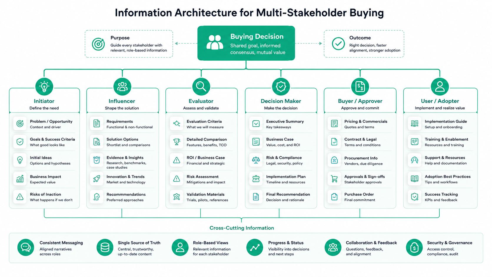
A redesign that starts with layout usually misses the core problem. The better starting point is the buying committee, because a B2B website has to do the work of a sales tool, not a brochure. The economic buyer wants confidence in business value. The manager wants to know whether the change will fit the team. The compliance reviewer, procurement contact, and technical evaluator all need different proof before the deal can move.
Start there, and the rest of the site gets sharper. The homepage, solution pages, proof points, and CTAs can all be built around the questions each role asks first, instead of forcing every visitor through the same generic pitch.
A good planning doc also locks in three to five measurable goals before design starts. Those goals need to be operational, which means sales and marketing both have to agree on what counts as an MQL and an SQL. If that definition is fuzzy, the team ends up debating lead quality after launch while the site is being judged on the wrong numbers.
What the planning brief should contain
A useful one-page brief holds more than a slogan and a few notes from leadership. It should include the ICP, the top pain points, the buying triggers, the objections the sales team hears most often, the proof assets already available, and the CTA preference by stage. If the site serves different audiences, add the message priority for each one so design doesn’t flatten everything into one generic value proposition.
The fastest way to waste a redesign is to make every page sound the same.
Persona insight should shape the page structure, not sit in a deck that nobody opens again. A technical evaluator needs depth, product detail, and integration context. A manager may need implementation risk reduced. A procurement reviewer wants credibility signals and clear commercial terms. The page should surface those pieces where they belong instead of hiding them in a footer or a dense PDF, because buried answers slow deals and create extra sales follow-up.
A practical planning checklist for a strategist or agency partner looks like this:
- Primary ICP definition so the team knows which accounts the site is built to attract.
- Buying-committee map so each stakeholder gets the right depth and proof.
- Core objections list so the copy addresses friction before it shows up in sales calls.
- Messaging hierarchy so the homepage and key pages stay consistent.
- Goal definitions so MQL and SQL reporting mean the same thing to everyone.
- CTA rules so demo, pricing, and contact paths aren’t chosen by habit.
The brief has to stay concrete. A vague goal like “more leads” does not help a designer decide whether the site should push a demo, a consultation, or a pricing conversation. A better brief translates ambition into something trackable, such as a lift in marketing-qualified form submissions within the team’s review window.
That is where strategy becomes design input. Without it, wireframes are just polished guesses.
Information Architecture for Multi-Stakeholder Buying
A committee-aware site needs a different structure from a single-persona brochure. The common mistake is to make the homepage flatter and simpler for everyone, then hide the evidence that a compliance reviewer, procurement lead, or technical evaluator needs to keep the deal moving. That site may look tidy, but it leaks pipeline.
Role-based navigation helps because it gives each visitor a clear path into the content that matters to them. The stronger version goes beyond a persona menu and asks three sharper questions. Which proof does each role need first, which CTA makes sense for that role, and how deep should the page go before the visitor can self-select the next step?
What committee-aware navigation looks like
A small or mid-market B2B site doesn’t need a huge menu. It needs a hierarchy that exposes enough depth without making people hunt. A useful pattern is a top-level structure built around problems, solutions, proof, and resources, with sub-navigation that splits by use case or role. That lets a buyer, manager, and technical evaluator all start from the same entry point and move toward the content they need.
The “demo or pricing within two clicks” idea matters here because information architecture now affects conversion, not just orientation. If someone has to click through a generic homepage, a vague solutions page, and a buried contact form before they can compare options, the site is making the buying process harder than it needs to be.
A simpler homepage can underperform when it oversimplifies for one stakeholder and hides the evidence another stakeholder needs.
The trade-off is real. A one-persona homepage can be elegant, but it can also erase the commercial detail that matters to the rest of the committee. A committee-aware layout may feel denser, yet it often works better because it reduces dead ends. For a technical audience, that might mean product depth and integrations near the top. For a procurement reviewer, it might mean security, terms, and pricing transparency surfaced earlier.
If you’re sketching the menu, think in hubs and layers. A “Solutions” hub can branch into industry or use-case pages. A “Why Us” hub can hold proof, team, and methodology. A “Resources” hub can support self-serve research without dumping every article into one long list. The goal isn’t more navigation. The goal is faster self-selection.
The practical test is simple. Can each role find the proof, CTA, and next page without detouring through irrelevant content? If not, the architecture is still serving the brand before it serves the buyer.
Page Anatomy that Converts Across the Buyer Journey
A B2B page that performs usually follows a recognizable order. First comes the problem, then the outcome, then the capabilities, then proof, then the next step. That sequence works because it mirrors how buyers evaluate a vendor. They want to know whether you understand the problem, whether you can solve it, and whether other people trust you enough to take the meeting.
The opening block should say the buyer’s problem plainly
The hero has to name the pain in the buyer’s language. Not “grow faster” or “transform operations,” but the actual friction the audience feels. If the site serves a technical evaluator, the opening might point to integration pain or implementation risk. If the audience is commercial leadership, the hero should focus on missed pipeline or slow handoffs.
A weak hero sounds polished and forgettable. A stronger one states the problem and the outcome together.
- Weak: “Modern solutions for growing teams.”
- Stronger: “Give buyers a clearer path to demo, pricing, and proof.”
After the hero, lead with the outcome statement, then move into three to five key capabilities. Put the most differentiated capability above the fold if the page is competitive. A generic feature stack wastes the first scroll. Buyers already know you have features. They need to know why your setup matters for their process.
Social proof should appear near the point where doubt rises, not as decoration at the bottom. That can be customer logos, testimonial snippets, review language, or a short case example. The useful test is whether the proof matches the objection. A security-sensitive buyer needs a different proof element than someone comparing service depth.
Copy rule: describe the result, then support it with the proof asset that fits the objection.
CTAs should match the stage, not the preference of the internal team
A demo CTA works when the visitor already understands the offer and wants a deeper conversation. Pricing pages support evaluation. Contact forms still matter, but they should not be the only route into the business. The right CTA depends on the ICP, the deal process, and how much friction the sales team can handle.
If you’re reviewing a page stack, compare the weak and strong patterns side by side. Weak pages make every visitor take the same action. Better pages let a buyer self-select into the right depth, which lowers friction for the committee as a whole.
For a cleaner example of lead-page structure, the guide on website design for lead generation shows how page intent and CTA placement work together. The same logic applies here, but B2B pages need more stakeholder depth and more proof at each step.
The point is not to decorate pages with more content. The point is to remove hesitation. When the page order matches the buyer’s mental model, the visit feels easier, and the next step gets clearer.
Technical Performance, Mobile, and Accessibility as Design Decisions
A B2B site usually fails here in plain sight. The layout may look polished in desktop mockups, but the buyer is often on a phone, under time pressure, and trying to compare you against two or three other vendors before the next meeting. If the page is slow, hard to read, or awkward to use, the committee loses patience before sales ever gets a fair shot.
Mobile behavior already shapes how people research vendors, and Foursets research shows how much traffic and buying activity now happens on phones. That changes the design brief for a B2B team. Mobile pages cannot be a shrunken desktop layout. They need to preserve the hierarchy, surface the proof, and keep the path to a demo or contact action clear enough that a hurried evaluator can move without friction.
Speed is part of that same decision set. The same research source notes that users expect pages to load quickly, and slow pages are tied to weaker conversion performance. On a B2B site, that usually means the first thing to suffer is the page that should have carried the strongest proof. If a pricing page, case study, or product overview loads sluggishly on a phone, the visitor may never reach the material that would have answered the objection.
What to accept in sprint review
Responsive design has to protect the lead path on a small screen. Large tap targets, short form fields, and clear spacing matter because buyers rarely interact with a site in a calm desktop setting. If a contact form requires zooming or careful pinching, the page is already asking for more patience than most decision-makers will give it.
Navigation also has to earn its keep. Sticky access to core pages can help, but only if it does not crowd the screen or hide the content that matters most. I usually push teams to keep the mobile structure simple and deliberate, because every extra layer adds cognitive load for a prospect who may be comparing you against a competitor on the same train ride.
Image and font choices belong in design review, not after launch. Heavy assets can make a site feel premium in Figma and still hurt real visits if they slow the page or make text harder to read on smaller screens. The trade-off is straightforward: stronger brand polish can come at the cost of conversion lift unless the visuals are selected with load behavior and readability in mind.
Accessibility is not separate from performance; it sits inside the same user experience. Foursets research reports that many homepages still fail WCAG accessibility standards, and only a portion of mobile sites hit a strong Core Web Vitals score. That gap shows up as avoidable friction for real buyers, especially on pages where the visitor is trying to understand a service, review proof, or submit a form.
Here’s the acceptance criteria list I’d use before launch:
- Mobile forms work cleanly on small screens without forcing pinch-and-zoom.
- Core pages remain readable with logical heading structure and enough contrast.
- Key actions stay visible without burying them under oversized hero assets.
- Images and fonts are selected with load time in mind, not just art direction.
- Keyboard and screen-reader paths are checked before the site goes live.
Accessibility often helps more than one group. Clear labels, logical focus states, and readable contrast help every visitor move faster.
For teams that want a broader implementation guide, the accessibility explainer on what web accessibility means for business websites is a useful reference. If the team needs to explain the growth side of the site to outside stakeholders, a resource like find digital marketing investors can help frame the discussion. The practical takeaway is simple. Speed, mobile behavior, and accessibility are design decisions because the page only creates pipeline when people can use it.
KPIs, Events, and Dashboards that Prove Pipeline Impact
A B2B site only earns its keep if the reporting stack connects page behavior to sales outcomes. The cleanest setup starts with a few metrics the team can maintain, then ties those metrics back to the design changes that moved them. That keeps the conversation away from likes and toward pipeline.
The core stack usually includes qualified form submissions, MQL to SQL conversion rate, pipeline value influenced by web, demo requests from key pages, and engagement on high-intent pages such as pricing or contact. Each metric needs a clear owner. Marketing should own the top of the funnel, sales should own follow-up behavior, and leadership should review the trend line rather than every click.
What to instrument
Track demo-page submissions, pricing-page clicks, contact-form starts, and form completions. Add scroll depth and bounce behavior on the pages where the buying question is most likely to appear. If source and persona data can flow into the CRM, sales can prioritize follow-up based on page intent instead of treating every inquiry the same way.
A weekly dashboard for marketing should show traffic to key pages, form completions, and the performance of the highest-intent CTAs. A monthly dashboard for leadership should add qualified pipeline, SQL movement, and any pages that influence opportunities. If the team owns investor-facing growth conversations, a resource such as Find Digital Marketing Investors can help contextualize how performance reporting gets packaged for stakeholders outside the marketing team.
| KPI | Primary Design Driver | Source |
|---|---|---|
| Qualified form submissions | CTA clarity, form length | Analytics and CRM |
| MQL to SQL conversion rate | Page relevance, proof placement | CRM |
| Pipeline value influenced by web | High-intent page flow | CRM and attribution |
| Demo requests from key pages | Hero message, CTA placement | Analytics |
| Bounce and scroll depth on key pages | Above-the-fold structure | Analytics |
For teams setting up the reporting model, the guide at the digital marketing KPI setting guide is a practical companion. The bigger point is that the dashboard should show whether the design is helping buyers move, not just whether the site is attracting visits.
A site redesign is much easier to defend when the metrics match the business goals from the planning brief. If the homepage gets traffic but the demo page doesn’t move, the problem is usually message, structure, or friction. The dashboard should tell you which one to fix.
A 12-Week B2B Website Design Roadmap
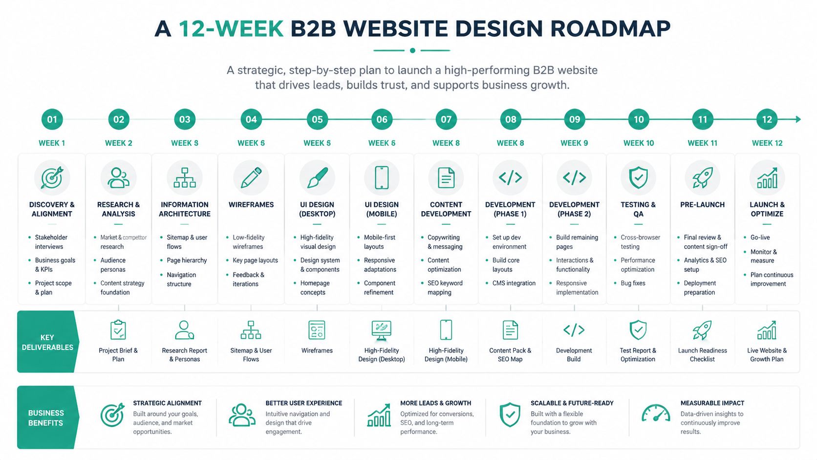
Weeks 1 and 2 cover discovery, ICP definition, and sales-marketing alignment. Weeks 3 and 4 move into sitemap, content inventory, and information architecture. Weeks 5 and 6 handle wireframes, page copy, and the first design system pass.
Weeks 7 and 8 shift into development, CMS build, and asset production. Weeks 9 and 10 cover QA, Core Web Vitals checks, and accessibility review. Weeks 11 and 12 handle analytics setup, staging review, launch, and a 30-day optimization window.
The cleanest go-live gate is simple. No launch without ICP documentation, agreed MQL and SQL definitions, and measurement in place. After launch, keep reviewing search behavior, CTA performance, and page intent so the site doesn’t drift back into brochure mode.
Ascendly Marketing builds B2B websites and lead generation programs around ICP clarity, conversion paths, and measurable reporting. If you need a redesign that supports sales instead of just refreshing the brand, visit Ascendly Marketing and talk through the site structure, proof assets, and tracking setup that fit your pipeline goals.