

Traffic arrives, forms get submissions, and the sales team still says the same thing: too many weak inquiries, not enough people who are ready to talk. That gap shows up in a lot of websites because the page was built to look complete, not to qualify demand. Website design for lead generation changes that. The site stops acting like a brochure and starts behaving like a filter, sending the right visitors toward one clear action and pushing everyone else into a cleaner next step.
The practical shift is simple, but many teams resist it. They add more navigation, more buttons, more offers, and more form fields, then wonder why the inbox gets noisier. A landing page benchmark summarized in industry reporting found a median conversion rate of 6.6% across 464 million visits, 41,000 pages, and 57 million conversions, with SaaS at 3.8%, events and entertainment at 12.3%, and the top 10% of pages at 11.45% or higher brandrums.com. That spread tells you the offer, the page type, and the clarity of the path matter more than raw traffic.
A lead-gen site usually gets judged by three signals. First, the page has one primary action, not a menu of competing choices. Second, the message matches the visitor’s intent fast enough to keep them moving. Third, the form and surrounding proof lower hesitation instead of adding work. If those three signals are weak, the site can still look polished and still fail at lead capture.
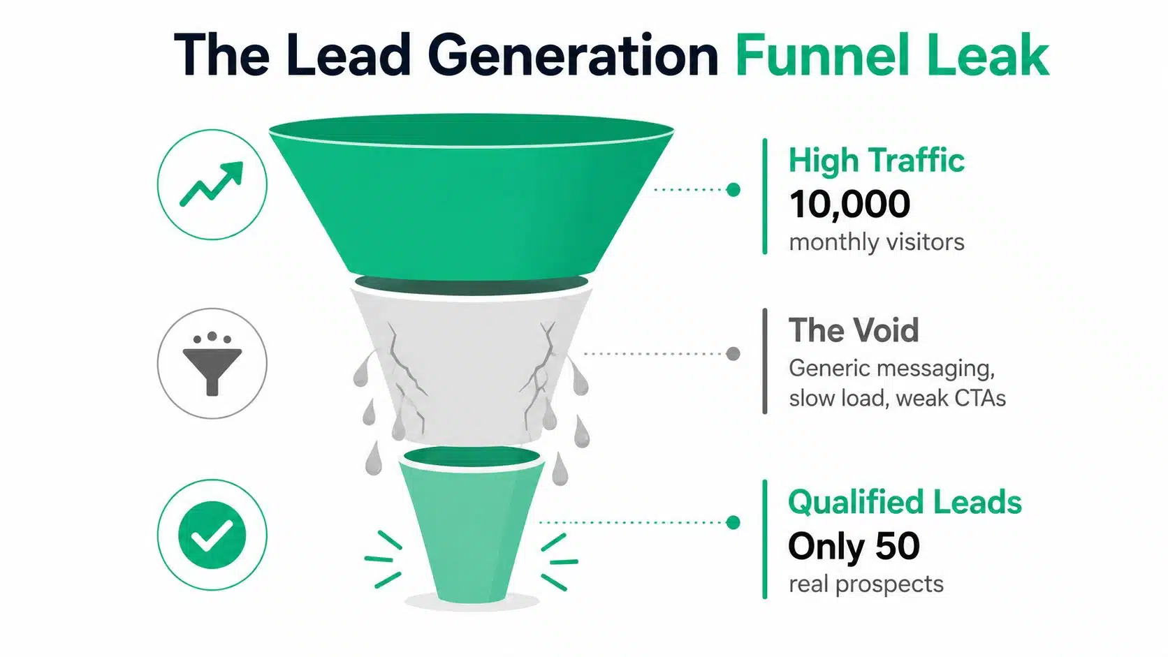
A quick self-audit helps. Open the homepage and ask three blunt questions. What is the one action I want first, what distractions compete with it, and what proof sits beside it? If the answer is fuzzy, the design is probably working against lead generation.
The better move is usually fewer paths, not more. A homepage packed with calls to action can feel active while creating decision fatigue. A deliberate page with a single next step usually gives sales a cleaner pipeline and gives visitors a simpler choice.
Why Most Lead Generation Websites Underperform
The failure usually starts with intent. A site is built to serve every visitor with one page and one route forward, then the team expects it to produce qualified inquiries. That structure can handle casual browsing, but lead capture needs fewer choices and more relevance, because ready-to-buy visitors do not want to sort through the site to guess what happens next.
Brochure sites leak intent
A brochure site spreads attention across services, awards, blogs, team bios, and several conversion paths. None of those elements is wrong on its own, but together they often blur the page’s purpose. A visitor who arrived with a problem should not have to hunt through the site architecture to figure out the next step.
A dedicated page usually performs better because it speaks to one need, presents one offer, and reduces the mental work needed to respond. Page type and offer focus matter more than decoration, which is why landing pages often outperform general-purpose pages brandrums.com.
Practical rule: if a page needs a paragraph to explain what the visitor should do next, the page is already carrying too much weight.
More features usually mean more friction
Adding plugins, extra buttons, or multiple forms rarely fixes underperformance. It usually adds decisions, slows the page, and leaves more room for hesitation. Visitors do not experience those additions as sophistication; they experience them as work.
A cleaner model is easier to run. Keep the page aligned to one offer, remove secondary paths near the main CTA, and make the next step obvious in the first screen. That trade-off matters for sales teams, because fewer paths usually mean cleaner conversations and less time spent sorting weak inquiries from real ones.
The conversion rate optimisation audit article fits that mindset because a good audit starts by finding where attention is leaking, then ranks fixes by impact rather than by cosmetic preference.
The self-audit that separates a lead site from a presence site
Use this quick check on your highest-intent page.
- One action: the page points to one primary conversion, not three.
- One promise: the headline speaks to one outcome or pain point.
- One proof set: trust signals sit close to the form or CTA instead of being buried.
If the page fails on any of those, the design is probably more about presence than lead generation. That does not mean the site is broken. It means the page was built to be seen, not to qualify leads.
Defining the Lead You Want
A lot of teams start with wireframes and only later ask who they want to attract. That order creates waste. The design always follows the strategy behind it, so the qualification work has to happen first.
Start with buyer fit, not form fill volume
A lead is only useful when it fits the sales motion. A small consultancy, a B2B services team, and a local contractor can all want leads, but the definition of a good lead is different in each case. The page needs that definition before a single headline is written.
The clearest way to build that clarity is to write down what a good inquiry looks like. Who has budget, who has authority, who has the right problem, and who is too early to sell to? Once those criteria are visible, the site can attract the right people and steer away the wrong ones.
Primary, secondary, and disqualifying paths
A recent guide recommends defining a primary conversion, a secondary conversion, and even a disqualifying action so the site does not optimize for requests that waste staff time mdtechteam.com. That framing is useful because it treats the website as a filter, not a funnel that should accept everyone.
A primary conversion is the action that creates the best next sales step. A secondary conversion can capture a warmer but not yet ready visitor. The disqualifying path is there to stop low-fit inquiries from taking up sales time. That might mean a page for smaller budgets, a self-service resource, or a clear statement about who the service is not for.
A practical brief for designers
A useful brief answers a few direct questions before creative work starts.
- Who is the ideal lead? Define role, problem, and level of readiness.
- What counts as success? State the action that matters most.
- What should get filtered out? Name the low-fit inquiries you do not want.
- What proof is available? List testimonials, case examples, or other trust assets.
- What happens after submission? Map the handoff so the page and sales process match.
A buyer persona development resource belongs in this stage because page design gets sharper when the audience is real instead of generic. I have seen teams begin with wireframes because that feels concrete, but the layout decisions get better once the brief names an actual buyer, such as a founder who needs qualified demo requests or a procurement lead who only moves after budget and timeline are clear. Once that brief exists, the rest of the build becomes easier to judge.
Anatomy of a Page that Converts
A high-performing page doesn’t feel crowded. Each section earns its place, and each block pushes the visitor one step closer to the form. The structure looks simple because simplicity does the heavy lifting.
The hero section does the first qualification
The hero has one job. It states a specific pain point or outcome and gives the visitor an immediate reason to keep reading. If the headline sounds like brand language instead of buyer language, the page has already lost momentum.
The supporting line should remove doubt, not add more claims. Then the CTA should be dominant, not one of several equally visible buttons. The page works better when the visitor can decide quickly and keep moving without scanning the whole layout for alternatives.
Proof, benefits, and objections belong in a narrow sequence
Social proof should appear near the point of decision, not as decoration. Benefits explain what changes for the buyer, while objection handling answers the questions that block a form fill. Those blocks only work when they stay close to the CTA and don’t drift into long brand storytelling.
A strong page also keeps message match tight between the ad, the landing page, and the form headline. If the ad promised a specific service or outcome, the landing page has to echo that language fast. When the visitor sees consistency, they keep their attention on the next step.
The lead-gen website design guide from The Little Website aligns with this structure by stressing one primary conversion action per page, trimmed forms, trust signals near forms, and mobile-first layouts.
Form placement should reduce hesitation, not create it
The form earns its spot when the visitor already understands the offer and trusts the next step. Long forms often underperform because they ask for too much too early. A shorter form lowers friction, and a clear CTA lowers ambiguity.
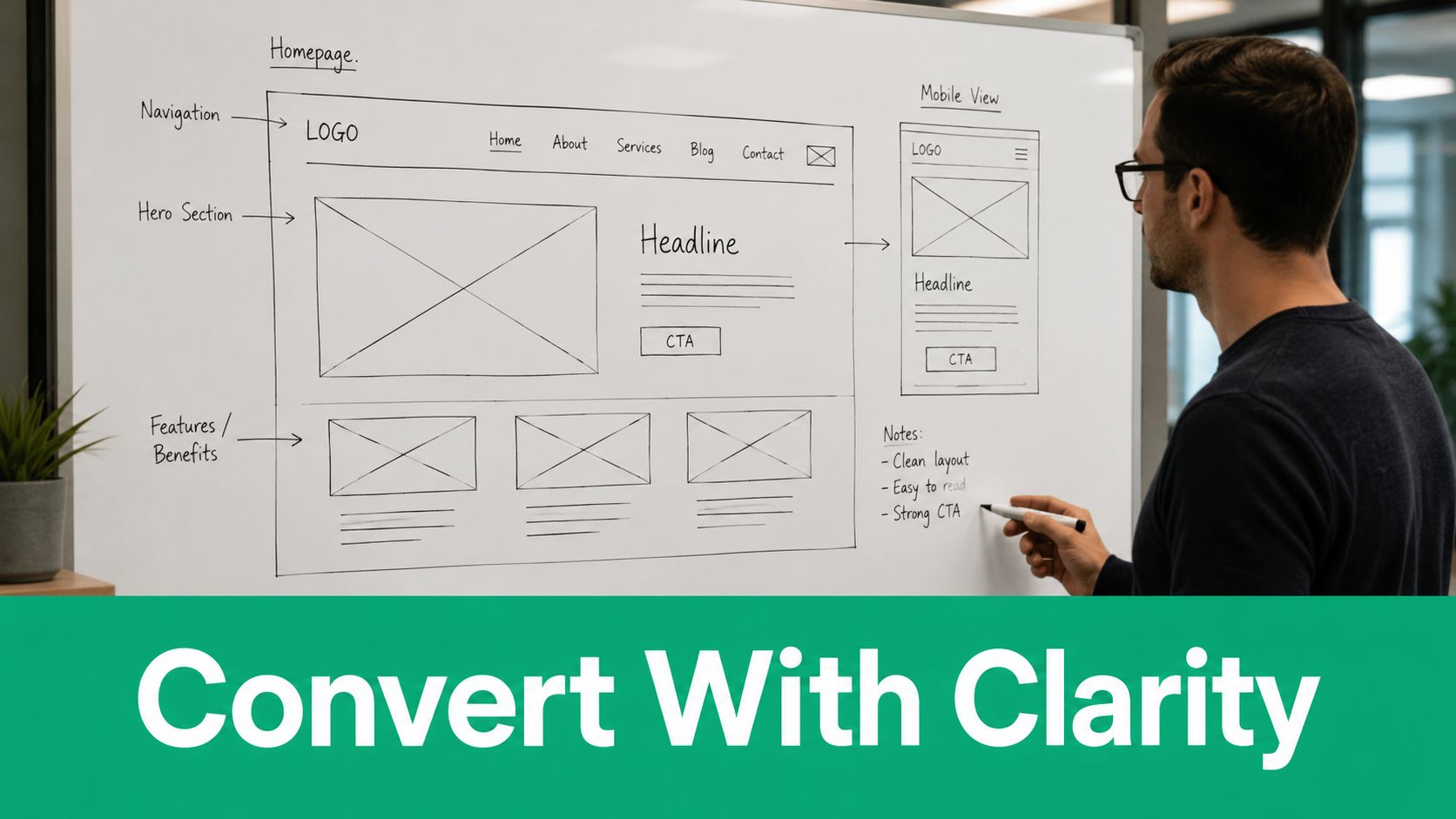
A good form feels like the smallest possible next step, not a test the visitor has to pass.
The best pages treat every block as a tradeoff. Add more proof, and the page may feel safer. Add more copy, and the page may feel slower. The job is to keep the useful parts and remove the rest.
A Redesign Story in Concrete Numbers
Redesigns become easier to believe when the numbers are plain. One documented website redesign case study showed lead conversion rate moving from 2.3% before redesign to 3.4% after redesign, a 47% improvement, while bounce rate fell from 63% to 39% newperspectivestudio.co.za. Those are not abstract metrics. They show a site that kept more people engaged and got more of them to take a lead action.
What changed in the structure
The case study reflects a familiar pattern. The redesign tightened the page structure, reduced confusion, and made the path to action easier to understand. That usually means a clearer offer hierarchy, fewer competing buttons, and better alignment between the page message and the visitor’s intent.
The bounce-rate drop matters because a lower bounce rate often means the visitor found the page more relevant or easier to use. The conversion lift matters because more people moved from interest to inquiry. Both numbers point to the same conclusion: the page started doing a better job of qualifying attention.
What the metrics do not show
Metrics rarely reveal the internal discipline behind the work. Stakeholders had to agree on the purpose of the page. Someone had to say no to extra features that would have made the layout noisier. Someone else had to protect the conversion goal when new ideas showed up late in the process.
Practical rule: a redesign fails fast when everyone can add ideas, but no one can remove distractions.
The redesign story also shows why teams should separate opinion from evidence. A nice-looking page that doesn’t improve behavior is still expensive. A simpler page that improves conversion is doing the job, even if it looks less elaborate in a design review.
The embedded video below is useful if you want a visual walkthrough of redesign thinking and how page decisions connect to measurable outcomes.
The lesson is not to copy the exact layout. The lesson is to identify the page’s friction points, test a cleaner structure, and keep the version that helps more visitors reach the form.
Speed, Mobile, and Trust Signals that Move Forms
Most lead-gen sites lose people before the copy gets a fair reading. Slow pages, clumsy mobile layouts, and weak form presentation create friction that feels small to the team and annoying to the visitor. The technical layer is quiet, but it decides whether the design gets a chance to convert.
Speed and responsiveness are conversion inputs
One lead-gen guide recommends designing for a 3-second load time or less perfectafternoon.com. That gives teams a practical benchmark when they decide what to compress, remove, or defer. Large images, render-blocking scripts, and bloated page builders are usually the first suspects.
Mobile deserves its own build logic, not a scaled-down desktop layout. The mobile-optimization guide from Ascendly Marketing fits that approach because mobile users need thumb-friendly buttons, real-device testing, and contact options that work fast on small screens. A sticky click-to-call option can outrank a form when the visitor wants immediate contact. An extra field that seems harmless on desktop can feel like a hard stop on a phone, and that tradeoff matters for sales teams that need fewer low-intent inquiries, not just more traffic.
Trust signals belong beside the decision point
Trust proof works best near the CTA or form. Reviews, recognizable logos, privacy cues, and similar reassurance lower the perceived risk of submitting details. The visitor is deciding whether to hand over personal information, so the page should answer that hesitation where it appears.
Placement matters as much as the asset itself. Hide the proof too far away, and the page makes the visitor search for confidence. Put it beside the form, and the reassurance arrives at the moment of friction, which helps the right prospects proceed without forcing sales to spend time calming every doubtful lead.
A quick technical troubleshooting list
- Compress heavy assets: large files slow the page before the offer can be seen.
- Simplify scripts: extra code can delay interaction.
- Check mobile forms on a phone: auto-fill, keyboard types, and button size all matter.
- Review crawlability and internal links: acquisition still depends on technical access to the page.
- Place trust proof near forms: the visitor should not have to hunt for it.
Fast, clear pages do not feel impressive to the team, but they usually feel easier to buy from.
The lead generation website design guide also pushes the mobile-first point by recommending actual phone testing, thumb-friendly submit buttons, and validation after deployment. That is the right mindset. Mobile is not a decorative breakpoint; it is a conversion environment.
Designing for Lead Quality, Not Just Volume
A high submission count can look healthy in a dashboard and still waste sales time. If reps spend more time sorting bad fits than talking to buyers, the site is producing noise. A lead-generation website should qualify as well as attract, because every extra form fill has a cost on the sales side.
Make the page filter before sales has to
Qualifying questions can do useful work when they are written with care. They can route enterprise traffic to a different form, separate smaller projects from larger ones, and push low-fit visitors to self-select out. That does not mean stuffing forms with every possible question. It means asking for the minimum information needed to route inquiries correctly.
Pricing transparency can also act as a filter. When a page is clear about scope or starting points, some visitors will remove themselves before they reach the form. That is a good outcome if the goal is to keep the team focused on leads that match the business model.
Design should support lead scoring
The site should not only collect names, but it should also create data that marketing can compare later. Which pages bring qualified inquiries, which pages create sales friction, and which offers attract people who never close? Once those patterns are visible, the design work gets smarter.
For teams that want to enrich the data after capture, the lead enrichment tools guide by Icypeas is a useful reference because it fits a qualification-first workflow. Enrichment gives marketing more context around a lead, which makes it easier to judge whether the page is bringing in the right people or just more contact records.
The core tradeoff is volume versus usefulness
A page that sends fewer but better leads usually creates less work downstream. That does not mean the top-line form count always drops. Sometimes the count stays similar, and the quality improves. Other times the count falls, and revenue gets cleaner because sales stops wasting time on poor fits.
The point is to align the page with the economics of the business. If the team values booked work, qualified demos, or serious inquiries, the design should sort for those outcomes first. The site becomes more useful when it behaves like a gate, not an open bucket.
Your 30-Day Lead Generation Site Launch Plan
A launch plan keeps the redesign from drifting into endless revision. The work moves fastest when strategy, design, copy, technical QA, and measurement have a schedule. A month is enough time to ship a focused version if the team keeps the scope tight.
Week-by-week rollout
| Week | Focus | Key Deliverables |
|---|---|---|
| Week 1 | Strategy lock-in | Define the primary conversion, secondary conversion, disqualifying path, and lead quality criteria |
| Week 2 | Wireframes and copy | Review page structure, write headlines, form labels, proof blocks, and CTA language |
| Week 3 | Design and build | Produce final page layouts, mobile views, forms, trust placements, and technical implementation |
| Week 4 | QA and launch | Test analytics events, form submissions, mobile behavior, load speed, and post-launch fixes |
The best launch checklist is narrow. If the strategy changes midstream, the page loses focus. If the copy keeps changing after design starts, the structure gets sloppy. A tight handoff keeps the build moving.
What to measure after launch
Track lead conversion rate, qualified lead rate, cost per lead, and time-to-first-lead. Those metrics show whether the new site is producing actual business value or just more form fills. Watch the pages with the highest intent first, then compare what the visitors do before and after they submit.
A structured post-launch window helps spot the weak points. If visitors click the CTA but don't submit, the form or offer may be too heavy. If they submit but the sales team rejects many of them, the qualification logic needs work. If traffic arrives but people leave too quickly, the page message or speed likely needs attention.
The cleanest outcome is not a flashy redesign. It's a site that gives sales fewer dead ends and gives visitors one obvious next step. Keep the page narrow, keep the proof close, and keep testing the pages that matter most.
Ascendly Marketing builds websites and lead-generation programs that focus on measurable outcomes, so the design supports qualified inquiry flow instead of raw traffic alone. If you want a site structure, page copy, and conversion path that are built around lead quality, visit Ascendly Marketing and take a look at how their process lines up with that goal.